Designing the Redesign
Approaching the Reinvention of Chronogram Magazine
By David Clark Perry & Brian K. Mahoney
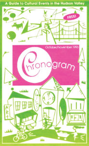
Chronogram was launched in 1993 with a simple premise: Provide readers with a guide to cultural events in New York’s Hudson Valley.
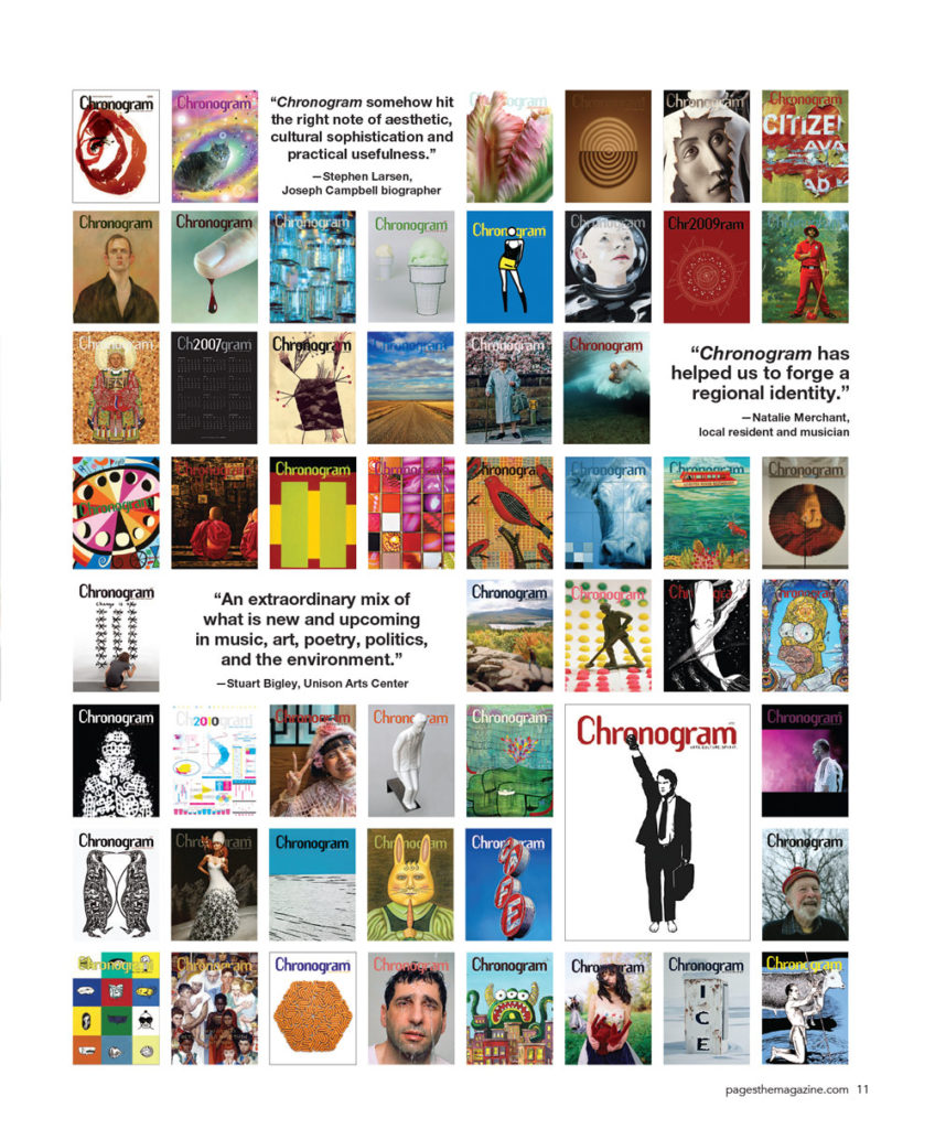
In the 24 years since, Chronogram has evolved from a flimsy zine launched by a couple of 20-somethings into Luminary Media, a multimedia company with four in-house titles and custom publishing, event, and marketing agency divisions. Our work now includes social media management, marketing communications, and business consulting — specialties we never could have foreseen ourselves offering a decade ago. But what’s fueled this growth is the brand equity of Chronogram. The publication’s authentic voice and role as trusted curator of the Hudson Valley lifestyle extends like a halo over all of our projects with readers and clients.
As we started considering redesigning our flagship publication, we were faced with a daunting question:
How do we freshen the design of Chronogram — creating a more readable, relevant, and useful reader experience in print — without losing our idiosyncratic voice and unorthodox design, the key attributes that have defined us?
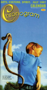
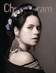
Chronogram has evolved through many small iterations. The first issue, in October/November 1993, was a Mad Libs-style flip book on newsprint. It was 72 pages, plus covers, and a compact 8 inches by 5 inches. (A size, one reader noted, that fits equally well in your back pocket or on the back of your toilet.) A year later, it morphed into a medium-sized book with a glossy cover, and then in 1999, into an oversized 10-inch by 13-inch full-color glossy. Since converting to this small tabloid format, we’ve made dozens of adjustments, changing a department layout here, a headline style there — constantly reevaluating and tinkering with the details.
So why mess with a good thing?
We love what Chronogram has become: a storyteller about a particularly robust and evolving region full of artists, entrepreneurs, thinkers, and doers. And our reader surveys consistently indicate that the magazine’s design and editorial are well-aligned with our readers and a kind of calling card for the region. A typical reader comment we get: “I was hesitant about moving out of Manhattan, but when I saw a copy of Chronogram, I knew I could live here.”
We might have sat back and just read and reread our fan mail, but we got the itch to mess with a good thing. For the last year, we’ve been talking in earnest about a redesign — and not just tinkering. We’ve been envisioning and incubating a wholesale, start-from-scratch, throw-the-baby-out-with-the-bathwater redesign. And this is the single question that has driven us: “How do we tell more stories, more engagingly?”
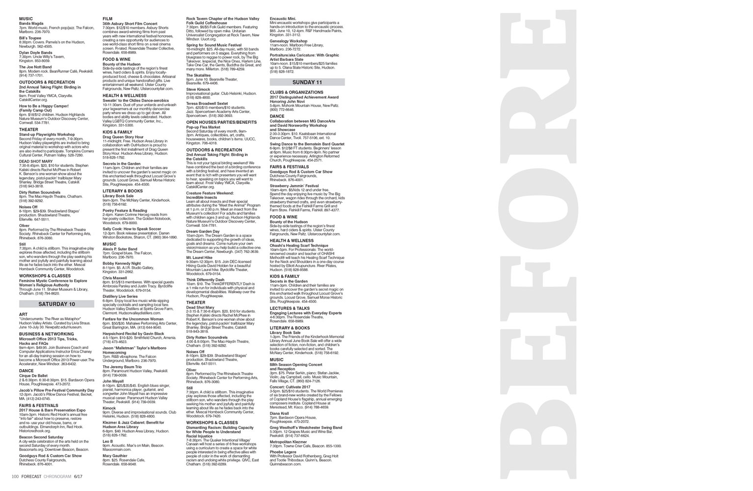
In the early stages of our process, all options were open. Would we create a new logo? Change the column grid? Throw out long-running departments? Eliminate the calendar listings, the foundation of the magazine for 24 years? Ideas we would never have considered even a few years ago now seemed plausible, even exciting. Here are several of the changes we landed on and implemented that have significantly impacted our magazine’s look and feel.
TYPE
One of our long-standing desires was to use the classic font, Helvetica, as the defining font of the magazine. The subject of much design debate (there’s even a documentary on the typeface that explores all sides of the issue), Helvetica has always resonated with us. It was a heavy influence on our previous sans serif font, Swiss 721 BT, so there has always been a taste of it in our pages. But we felt that going strong and central with it would provide an anchoring contrast to the more playful fonts we want to incorporate into features, callouts, and pull quotes.
A common piece of feedback we get from our reader surveys is that our body type is hard to read. We surveyed a wide range of magazines to see how they handle body type, and after experimenting with the impact on word count, we transitioned from Sabon to a heavier-bodied font, Caslon, and decreased the leading.
We also went from a two- to three-column text grid where possible. With a magazine of Chronogram’s dimensions, a two-column format is a bit wide, but half-page vertical ads sometimes necessitate running content in the adjacent space. To avoid the wide standard text column, we designed sidebars to run in one of these columns and to be readily identified as editorial whether they appear within an article or alongside ads. Sidebar type is larger and utilizes lists, bullet points, and bolder type treatments.
When story length necessitates running text in ad-adjacent spaces, we use a range of pull quote and callout options that add dynamics to the column rather than running photos that will compete with the graphic, visual ads.
WHITE SPACE
They say a picture is worth a thousand words. How much is white space worth? To us, it’s worth a lot as a design element, and we looked for a variety of ways to make more of it possible. As underrated as the silence between musical notes, white space is the canvas upon which the page elements exist. Over the years, some of our layouts became crammed with type, images, rules, info boxes, and icons — too noisy. We sought to strip out the nonessentials and let the pages breathe.
We systematically reviewed our word counts for each section and made judicious cuts. Over the years, we had experienced “word count creep” with many writers pushing up against an already crowded space. Resetting the dials on word count was a useful exercise in seeing what was really necessary for each section. Cutting 100 words from one-page stories, for example, made a big difference in the perception of spaciousness on the page. The cuts enable more easily digestible content and the space for callout boxes that point readers toward our website for more information and multimedia content. (Keeping writers to the lower word counts will be an ongoing effort!)
We looked at white space in relation to our images as well. There’s certainly a power in running full-bleed images, especially in a 10-inch by 13-inch format, but that treatment loses its effectiveness if it isn’t contrasted with smaller, in-frame images. An image doesn’t always need to be large to have an impact — just look at postage stamps or anything you see on your iPhone. It’s simply a matter of choosing the right image and then using a layout that directs the reader’s attention effectively.
ENTRY POINTS
For too long, our pages were text-heavy walls of words. With the redesign, we looked to not only cut words, increase font size, and expand white space, but also to add more entry points that lead a reader into a page. In our new format, we make sure that no page is a sea of type, and we utilize drop caps, pull quotes, and inventive type treatments to attract readers’ attention and invite them into each page.
STRUCTURE
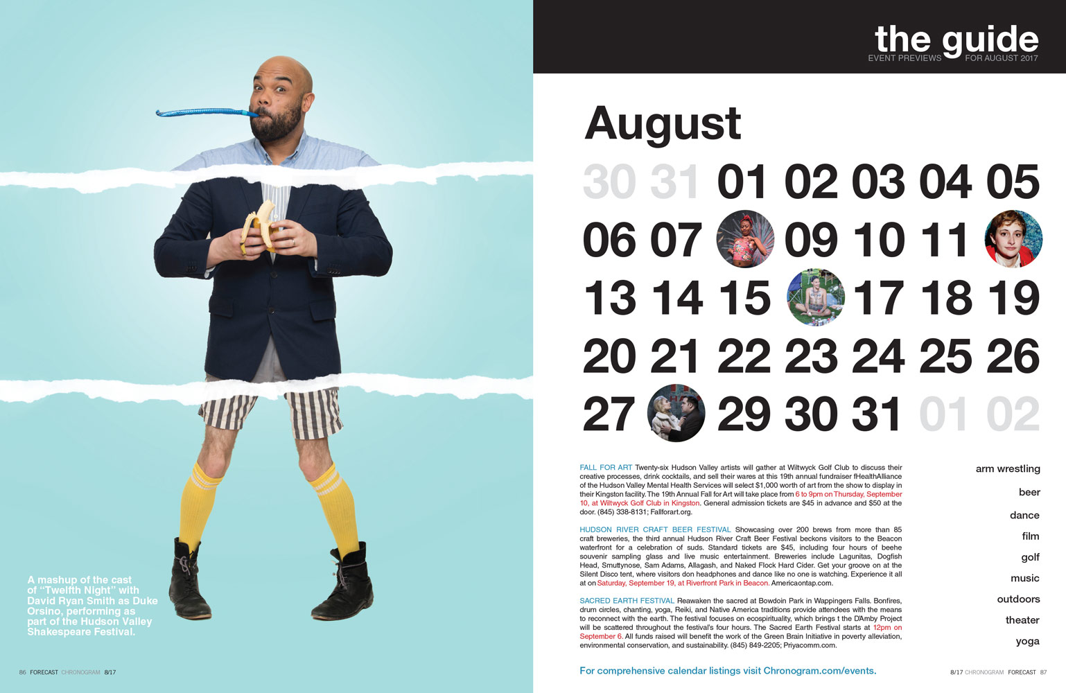
Chronogram’s evolution from a utilitarian guide to a content-driven read was nontraditional in many ways, including the magazine’s structure, which never had a standard feature well. We regularly ran feature-length pieces and special sections, but the bulk of the content was presented as departments of mostly medium-length pieces. We wanted to break that up and have space to stretch out, so in the redesign, we developed our own version of a feature well. First, a long-form piece with supporting art but weighted towards text. Second, a medium-length piece profiling a regional personality, with a lean toward art and more images. Third, a photo essay, on any subject, with robust captions. This restructuring meant shortening the length of several of our departments, which was difficult to do, but it was clear that the greater variety of article lengths makes moving through an issue more intuitive and enjoyable.
UTILITY
Following the guiding principle of telling more stories, better, we did what at one time seemed unthinkable: We took out the calendar listings. (The name of the magazine actually refers, with a little creative license, to a calendar; the literal meaning of chronogram is “time writing.”) For many of our readers, Chronogram is the when and where for events they care about. However, because of our monthly publication schedule, the print calendar is not all-inclusive, and though edited, doesn’t offer much more than the basic facts. In the redesign, we have preserved eight to 10 curated previews about the most interesting events of the upcoming month. And we’ve shifted the calendar completely to our website, where it can be comprehensive, paired with audio/video, and user-generated. Ultimately, we more than tripled the events receiving feature treatment in the print version while also achieving a better-looking magazine.
STAYING RELEVANT
When Chronogram started in 1993, there were no smartphones; computers were still relatively expensive for casual use; and most online experiences consisted of message boards and the iconic “You’ve got mail” ding. Print was where you got your information. These days, digital is print’s parallel universe, and Chronogram lives in both.
Our readers want to engage with us on Facebook, Instagram, and Twitter. Our print version is digitally aware, and we extend the content we’re presenting on the page to our stories online, adding more photos, audio, video, and resource links that don’t fit in the magazine. For the redesign, we made sure that this complementary relationship between print and website persists.
One of the most satisfying things about the Chronogram redesign is that it wasn’t a last-ditch effort to rescue a failing publication. It was a way to give an appreciative audience more of what they love in a smarter and more beautiful container. Highlighting what is good is one of Chronogram’s strongest characteristics, and we brought that attitude to our work on its latest incarnation.
David Clark Perry is art director at Chronogram Media and provided art direction for this article. Brian K. Mahoney is editorial director at Chronogram Media. Connect at tinyurl.com/linkedin-perry and tinyurl.com/linkedin-mahoney.

