
By Alexandra Paige
How many times have you seen your work in print and thought, “That’s not what the color looked like on my monitor”? It’s a challenge, this translation of color from the computer monitor to ink on paper. And for good reason: You are caught between two fundamentally different color models.
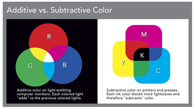
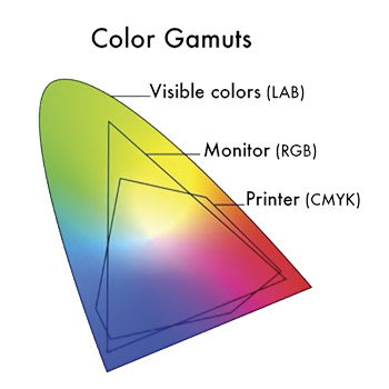 Your monitor (and any other digital device) displays color using the RGB color system. The monitor generates three colors of light (red, green, and blue), and the pixels in the screen blend these in different combinations and intensities to achieve an impressively large color range called a gamut. Since RGB color is made by adding light together, it is known as an additive color model. The more you add, the lighter the color gets until you end up with white. We’re talking about glowing pixels, and that’s why you can create colors on a monitor that glow brightly or even fluoresce.
In contrast, printing presses — and your desktop inkjet printer — use the CMYK color system, which relies on four ink colors: cyan, magenta, yellow, and black. When combined, these produce a significant but relatively smaller range of colors than you can see on a glowing monitor.
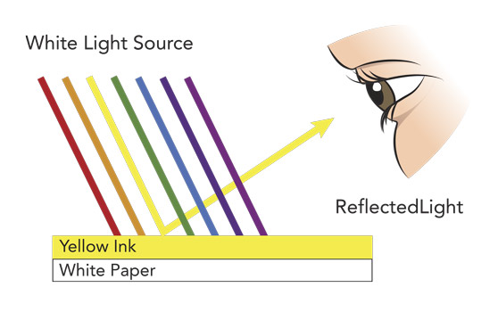 CMYK is known as subtractive color because the ink acts like a transparent filter that subtracts lightwaves from the ambient light as it falls on paper. Light passes through the ink and is filtered. In fact, this happens twice. When the light strikes the surface of the paper, much of it bounces back and is filtered a second time as it passes through the ink again on its way to your eyes. The more ink you add, the more lightwaves are blocked and the darker the color appears. The difference in paper plays a role here, too. Stocks reflect light to varying degrees. In fact, there’s no paper surface that reflects all of the light that strikes it.
It’s a tall challenge. We’re trying to compare an image on a monitor (whose gamut and brightness are almost limitless) with the appearance of a printed image that has a limited gamut and is affected by the color and brightness of ambient light and the color and reflectivity of paper.
How to Manage Color
I work with publishing professionals day-in and day-out who want to know how to manage the difference in these two color models. They need to reliably anticipate the color they’ll see in print. There’s no perfect way to do this. We know that printed color cannot simulate digital color, so we have to work the other way around. We need to make the monitor image predict print. Fortunately, there are things you can do to constrain the color on your monitor so it approximates the color you’ll get with ink on paper. It’s a very doable three-step process.
1.) Calibrate Your Monitor
In the RGB color space, each pixel combines a certain amount of red, green, and blue to display a given color. On displays that have been properly calibrated, the color value will always look the same. But if your monitor’s red value is set too high, your images will appear warmer. If the blue value is too high, they’ll appear cooler. If your brightness is too high, the whites and colors will appear brighter and have more contrast than you’ll ever see with ink on paper. This is why it’s essential to calibrate your monitor.
Calibration creates a relationship (called a “profile”) between your monitor and an absolute colorspace. It is essentially a lookup table that tells the monitor how to render each specific value using color and brightness. Calibrating to a profile ensures that your monitor simulates the lower brightness and smaller colorspace of ink on paper. A thorough calibration also accounts for the color and brightness of the ambient light surrounding your monitor. This is essential because this light affects your view of color. Calibrate your monitor once per issue at a minimum, and monthly if color management is critical for your publication.
2.) Use the Right Color Profile
In addition to a calibration profile, you also need a second profile to translate the color information in your image file to the color range of your output device. Both the printing process (offset, laser, and inkjet) and the equipment (broadly speaking, offset presses, laser printers, and inkjet printers) have different capacities for reproducing color. These profiles, called output or .ICC profiles, translate your specified colors to get the best possible results. In the case of outsourced printing, commercial printers typically provide generic or custom color profiles you can use to ensure optimal color given their equipment. (In Photoshop, go to Edit > Color Settings.)
You can take this one step further. You can actually soft proof your files on-screen with these settings in place. Applications including Photoshop and Lightroom offer a soft proof view that predicts what you will see in print based on the profile you’ve selected for your output device. (In Photoshop, go to View > Proof Setup > select output profile.)
Keep in mind that not all programs are created equal, even after your monitor is calibrated and your output profiles are in place. InDesign, for example, is not nearly as color accurate as Photoshop or Lightroom, both of which are designed for color viewing.
3.) Check Your Numbers
Photoshop enables you to “read the numbers” (CMYK color values) of the colors you intend to print. Since there is not a perfectly accurate way to truly see colors on-screen, check the numbers, or the percentages of ink coverage in a given color.
This is particularly helpful when you’re trying to determine how “black” your black is or how “white” your whites are. When you convert an image from RGB to CMYK, solid black areas will often convert to a CMYK color breakdown that contains only 90 percent black along with a combination of cyan, magenta, and yellow. This may look “black” on your screen, but it will not print as dark as a mix containing 100 percent black. Or, you may see white on your screen, while the numbers show a small percentage of color that will make your white look dirty when printed. (In Photoshop, go to Window > Info > set Info palette to CMYK.)
When you integrate these steps into your routine, your images will display on-screen with less color saturation, gamut range, and glowing brightness than you’re used to. This will take some adjustment, but it’s worth it. You will get a more realistic view of how your images will appear in print.
Alexandra Paige is a color and image specialist at Lane Press. Connect via paige@lanepress.com.
Calibration Tools
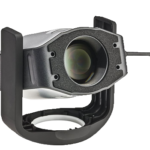
The simplest and least expensive way to calibrate your monitor is to use a calibration device. This tool looks like a computer mouse and hangs from the top of your monitor while software tests and adjusts your color values. Simply plug it into your computer, install the included software, and follow the prompts. There are a number of decent calibration tools available, but these two are my tried-and-true favorites.
X-Rite EODIS3 i1Display Pro ($200)
This is my #1 choice based on quality, affordability, and ease of use. It includes options for manual adjustment and customization as well as profile options for multiple printing methods.

X-Rite CMUNDIS ColorMunki Display ($125)
This is a slightly less expensive and simpler model. It uses the same software as the i1Display Pro but offers fewer customization options. This is a great tool for anyone new to monitor calibration.