What Limits?
Our conversation with a creative director who sees resource constraints as entertaining obstacles to overcome
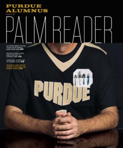
Kat Braz, the senior director of creative communications at the Purdue Alumni Association, has learned — through trial, error, and necessity — to stretch precious resources.
A team of four (herself included) produce Purdue Alumnus while also working with her slightly larger team to generate everything for this office (read: the magazine takes up no more than one-quarter of each person’s time). For her first five years in the job, the magazine team was a mere two people.
Her philosophy? If you’re a magazine publisher lucky enough to have three things in ample supply — money, time, and talent — your magazine is guaranteed to be all-great, all-the-time. But if you’re most publishers, you make do with varying amounts of these key resources. And if you still want your magazine to be awesome? Well then, you have to get really creative.
With a background in art direction, Kat is adept at doing this with the visual side of a magazine. So we asked her to share her strategies for laughing in the face of constraints and making your art amazing despite them.
#1 MONEY FOR NOTHING? GET YOUR PICS FOR FREE
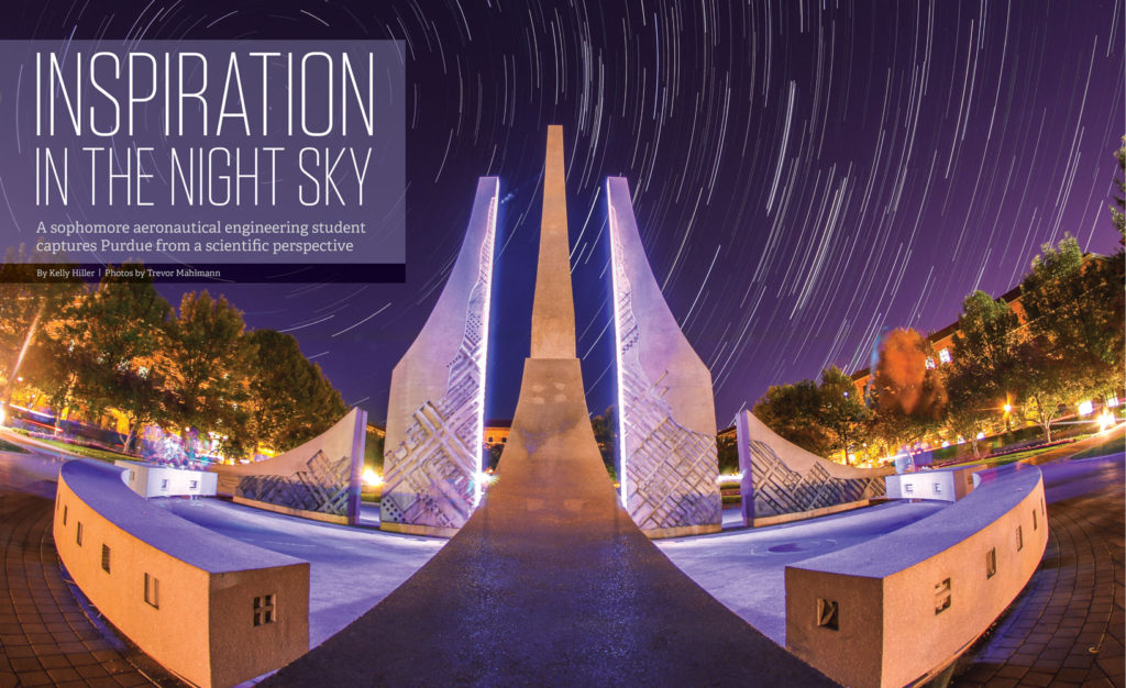
“Any day you can get quality art for free is a good day. I’ve found there are a few ways to do this with photography. Find an alumnus who’s a professional photographer — a documentarian, a travel or nature photographer — and pick a discrete project to profile that says something about that person. Maybe you have a staffer who’s a solid hobby photographer and can shoot a project for you. Probably my favorite resource, though, is students. Look at their study abroad photos; check out their photography class projects and exhibits. They produce some great work and are excited just to get published.
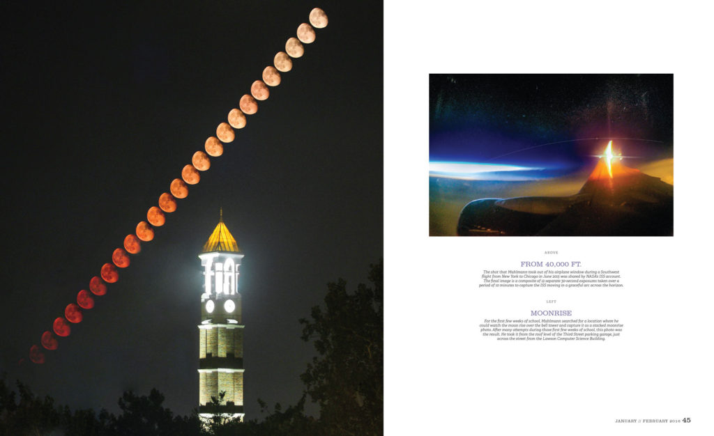
“I troll the Purdue community on Reddit for story ideas and came across a student from our aeronautical engineering program who takes photos of the night sky from around campus. They’re amazing, artistic photographs. I was able to make an entire photo story out of stuff that was already shot. … The thing about students is you can’t plan ahead for them to provide photos for a specific story; they just kind of come to you like stray cats.”
#2 MIX IT UP
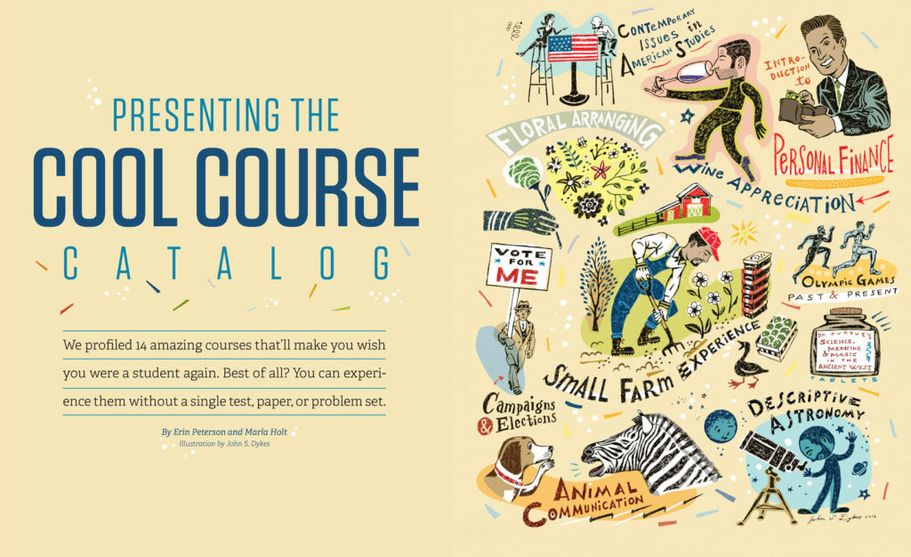
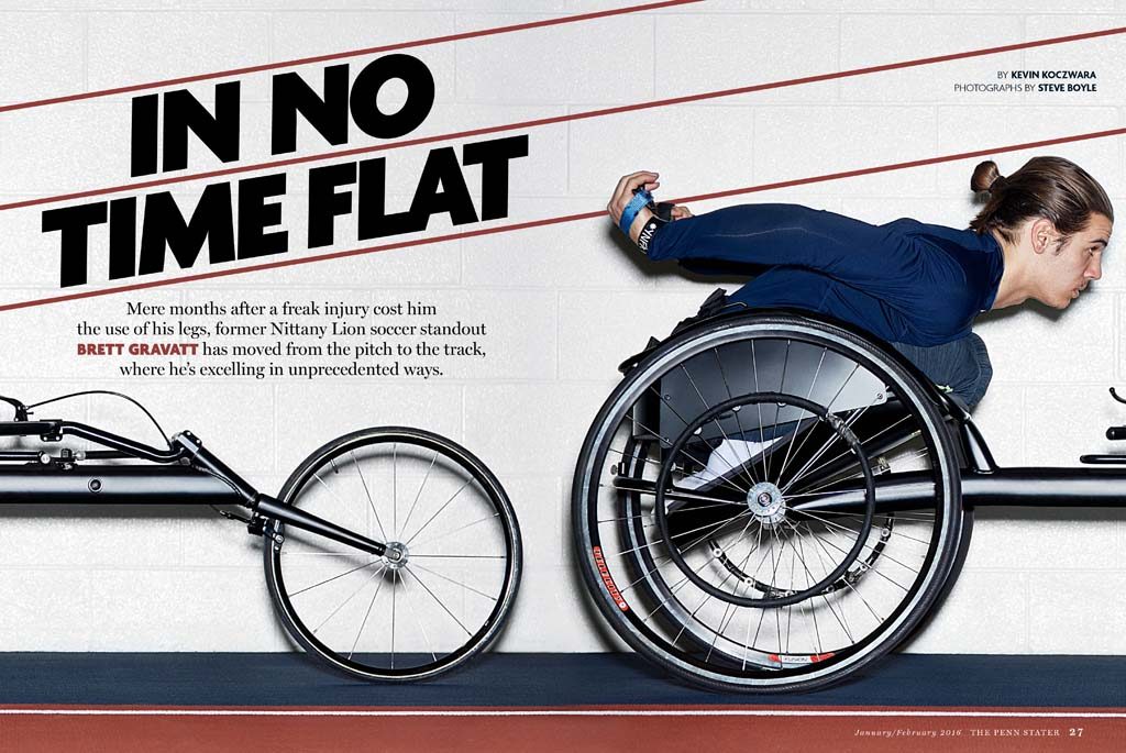
“It’s OK to break rules — or what we perceive to be the rules. There’s no tenet that requires you to open a story with a photo and then use only photos throughout the rest of the piece — or to open with an illustration and then use only illustrations. This is especially true with illustrations because they’re so expensive. Maybe you invest in one for your opening spread and then use photos — even stock photos — for the rest of the piece.”
#3 DRESS IT UP
“Designers can have a defeatist attitude when you give them art that’s poor or just boring; they’ll say, ‘There’s nothing I can do with this.’ I say, challenge yourself to take it and make something more of it. You can do wonders with just toning. Especially if you’re trying to pull together images from several sources, maybe taken in different time periods or with different technologies, the pieces can have a very different look that would be inconsistent in your story. Take them all, make them black and white, and then tone them all funky colors. It’s an easy way to unify everything.
“This is another one of those rules where you think, ‘Oh, I can’t make somebody’s skin orange, or blue.’ Why can’t you? Who’s standing there telling you you’re not allowed to do that? You’re allowed to make things interesting, and you should push yourself to do just that.”

#4 CROP IT LIKE IT’S HOT
“Any photo — literally, any photo — can be way more interesting with cropping. This is what separates strong editorial designers and art directors — how they’re cropping that image. When you go in there really tight, you end up with a whole new image. That’s why I think Torchbearer’s cover with the posthumous tribute to legendary coach Pat Summit is so great. Summit was a coach there for decades. Think of the hundreds and hundreds of photos they would have had to choose from, and they could have gone with the usual: her yelling from the sidelines, her standing with an arm around a player, or hanging a championship flag. Instead they boiled it down to her single eye. The cover is so bare, but with that crop, it’s so evocative. You feel like you’re looking into her life. When you’re cropping to this level, you allow the art to sing.”

#5 AYKM?! I DID NOT EXPECT THAT
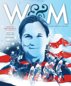
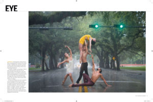
“One way to elevate your art is to push yourself to be bolder. Do something that doesn’t make sense — that will have your readers saying, ‘What the heck’s going on here?’ The University of Richmond Spring/Summer 2016 cover story is a great example. Immediately, I’m intrigued by the cover — the dancer looks like she’s levitating. And then you open up to the inside spread, and there are dancers in the pouring rain? In the middle of the street? With a traffic light that’s turned green? I’m thinking, aren’t there cars coming? It’s completely unexpected — and totally exciting. And it’s much more riveting than showing the dancers on stage.
“This was Richmond’s cover story, but it’s not a feature article — just a four-page photo story right in the front of the book. Are you allowed to do that? Richmond says so.”

#6 GET CRAFTY
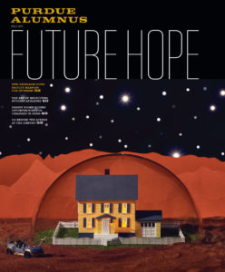
“When we have time and talent, but not so much budget, we look for ways to stage and shoot our own covers or feature openers. For our latest cover, we created the scene of a home on Mars. No problem. The cover teases a story about our faculty’s research-based reasons for hope about the future — one of which asserts that colonizing Mars might be possible in our lifetime. So we bought (and later returned, good as new) a model train house, a clear dome, two colors of sand (didn’t return the sand). I poked holes in a black sweep with my husband’s awl to make stars. Our multimedia designer, who usually doesn’t work on magazine photo shoots, painted a matchbox car to look like a space rover. Our graphic designer made the Martian landscape with rows of red construction paper. Our back-of-book designer assembled the model train fence on
turf. We shot the whole thing in our reception area.
“Don’t be intimidated by other titles that appear to have an entire prop budget or a videographer they can send to another country. Do what you can with what you have — and don’t be afraid to dig your hands in and create something.”


#7 BEG, BORROW, STEAL
“Some things just can’t be made. So you borrow them.
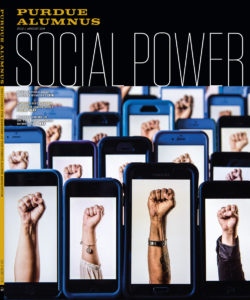
“My favorite example of this is when we borrowed 40 cell phones for our Social Power cover. Let me tell you, people do not want to part with their cell phones!
“This cover story explored what activism on campus looks like today — in particular, that students organize largely through social media, where ideas take shape and spread very quickly. We decided to use the raised fist because it’s such a universally recognized symbol of protest. We set up shop in a storage closet in our union building and, as people passed by, I asked if they’d sit for quick photos of their fists. Then we sent out an SOS to staff to borrow smart phones, texted an image to each one, and set the phones up on a spice rack for the shoot.
Incidentally, this cover landed me in some hot water. We received some letters and a few calls to the president’s office from people who thought the cover and the use of that sign was abrasive. And that’s OK. ‘Cause here’s the thing: Before we started trying to think about our art differently, we didn’t get a whole lot of letters. Our readers are engaging with our publication. They’re noticing.”

