


The Power of Perspective
How a collaborative team used stepping back as a way to move The Catholic University of America’s alumni magazine forward.
By Jodi Macfarlan
It’s an old but perpetually heartwarming story: Christmas Eve 1968. As the Apollo 8 crew rounded the Moon on its fourth orbit, astronaut Bill Anders looked out and caught a view of the Earth rising above the lunar horizon—a small blue-and-white marble floating amid the void. In awe but still thinking clearly and quickly, Anders grabbed a camera loaded with color film and snapped one of the most iconic photos ever taken.
“We came all this way to explore the Moon, and the most important thing we discovered was the Earth,” Anders later said of the mission. The image he took, known as “Earthrise,” is often credited with jumpstarting the environmental movement, as people saw what they’d never seen before: Our planet from the outside, in all its beauty and fragility. The Earth hadn’t changed, of course, but we suddenly had a new perspective from which to take it in.
We all know this to be true. Sometimes, the closer we are to something, the harder it can be to truly see it. It’s only when we step back that the picture makes more sense.
At Journey Group, we’re in the business of helping our clients do that: step far enough away from their work from time to time to see things more clearly. As a collective of creatives and a design partner to great organizations, we’ve been designing magazines for more than 30 years, spanning industries, formats, and budgets. Across three decades, we’ve redesigned a broad array of magazines, following a trusted process of collaborative workshops and iterative prototyping. The goal is always to honor each publication’s legacy and editorial mission while also helping it to stand out in today’s crowded media landscape.
Take, for example, our recent work with The Catholic University of America. In 2024, Catholic University in Washington, D.C. came to us for a full editorial redesign of their alumni magazine. They were fresh off the heels of a university-wide rebrand, having redefined their messaging, and they wanted the magazine to follow suit.
EDITORIAL CONCEPT
As with every magazine redesign, we focused first and foremost on one thing: nailing the editorial concept. We believe this is the most crucial part of any redesign process, and it merits focused time to get it right.
We weren’t just looking to create new fonts and colors and layouts to respond to the new brand; we were seeking to answer such questions as: What is the purpose and vision of the magazine? Who do you want your audience to be, and how do you want to speak to them? So we spent the bulk of our magazine redesign “workshop” with Catholic’s editors homing in on what sets their magazine apart editorially. What could this magazine be that no other magazine can?
We uncovered this vision: The team wanted the magazine to be recognized as a voice of THE university of the Catholic Church in America. It would include school news, yes, but also aim to position itself as a trusted source of insight and encouragement for a wider Catholic audience, with the potential to impact American Catholicism at large.
Here’s how we ultimately articulated the editorial concept together:
We foster meaningful conversation at the intersection of Catholic thought, spirituality, and contemporary life, bringing to light the holistic vision of our faith for human flourishing.
Only once we had this vision statement as our guiding force were we able to effectively begin working out the nuts and bolts of the visual redesign. We continued our workshop with Catholic by exploring all of the attending decisions of art direction—structure and flow, form, cover, wayfinding, typography, color, layout, and overarching visual language.
STRUCTURE & FLOW
Structure and flow provide the rhythm and pacing of a reader’s experience.
We use the metaphor that reading a magazine should be like experiencing a three-course meal: You’re welcomed in with lighter, bite-size department stories that whet the appetite; you’re then presented with bigger, meatier stories in the feature well; and you finish the book with something short and sweet.
An appetizer: A highly visual, lighter department up front.
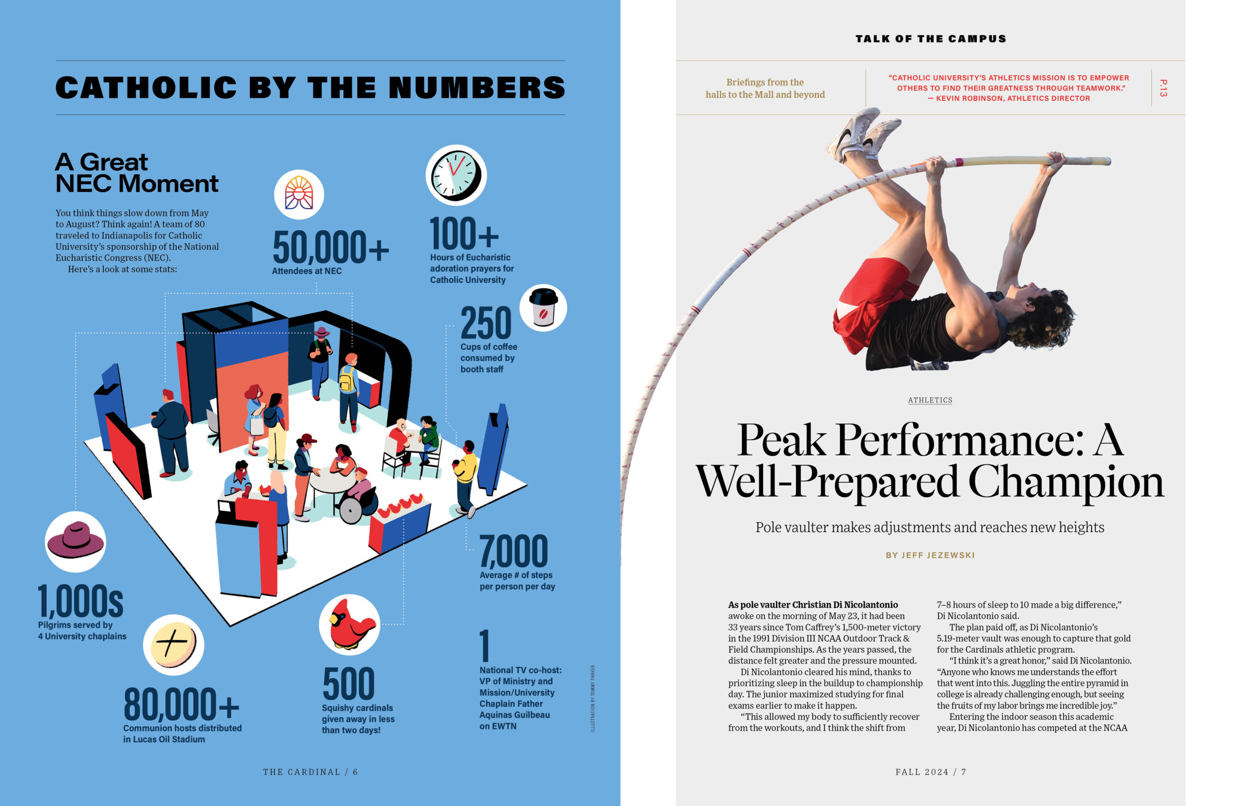
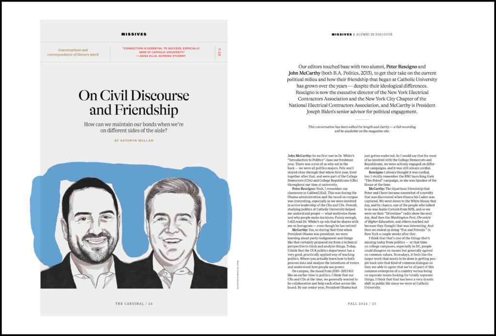
Toward this end, we worked with the Catholic team to create new front-of-book departments for their newly redefined audience, combining a collection of short-, medium-, and long-form pieces of varying formats (e.g., news pieces, short reflections, Q&As, student spotlights). For example, we organized content into three new sections: Talk of the Campus (“Briefings from the halls to the Mall and beyond”); Portraits (“Dialed-in spotlights of the University’s most compelling figures”); and Missives (“Conversations and correspondence of literary merit”). The editorial concept planned for deeper thought pieces in the feature well, finishing with bite-sized, end-of-book departments, such as class news and book recommendations.
Meaty features in the middle, with bold openers like this one.
We believe strongly in the intentional use of both whitespace and content surprises (like a full-page illustration or a poem), so we thoughtfully considered where we might place such visual or editorial “breaks” to help the reader avoid visual fatigue and/or reset attention.
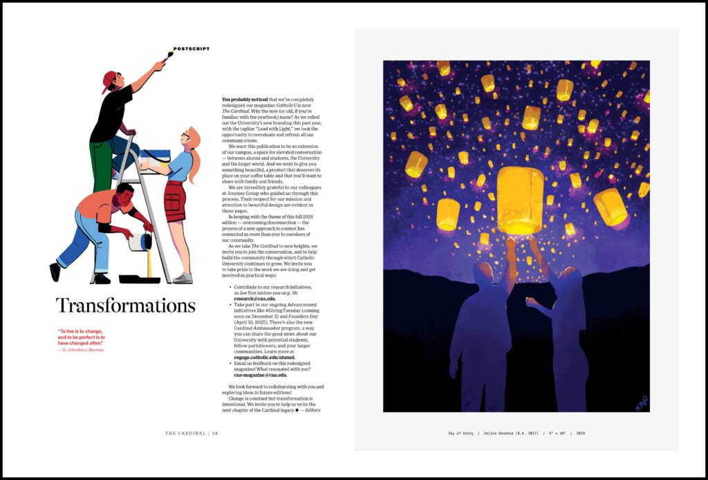
A short and sweet “Postscript” to close the book.
FORM
A perfect-bound book with medium-weight pages reflects the quality of Catholic University as an institution.
We then explored how to physically package these structured stories, with the goal of making an artifact worthy of keeping and sharing.
The options are seemingly endless, so we worked with Lane Press to determine the most efficient size and page count for its presses, and then considered the paper dummies Lane provided in a range of paper qualities. We ultimately decided on a perfect-bound book filled with matte, medium-weight pages—choices we believe reflect the quality of Catholic University as an institution and its desire to enhance its positioning as a trusted authority.
COVER
Together, the team decided during the editorial-concept process to drop the former CatholicU name in favor of The Cardinal, signaling a change to readers right up front. With this new identity, we hoped to position the magazine as a trusted voice for not only alumni, but also American Catholics at large. And because the cover is the first impression readers get of the magazine, we wanted The Cardinal’s cover to immediately signal its editorial content pillars of thought, spirituality, and beauty. How would we do that?
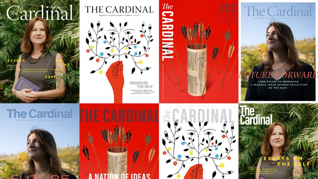
In the design process, we created sample covers to explore elements like the nameplate, cover lines, illustrations, and photography.
We steered Catholic toward more clearly art-directed covers, whether featuring conceptual illustration or hired photography. Together, we spent time considering the merits of other alumni magazine covers and then translated the team’s ideas into sample covers showing various nameplate and cover line explorations atop imagery. We arrived at a cover with a large nameplate and fairly minimal cover lines, letting the illustration or photography drive connection and convey a sense of authority and elegance.
WAYFINDING
Designing a magazine with visual signposts to guide the reader provides a smooth user experience and builds a sense of trust. For The Cardinal, we sought to establish a comprehensive system—from a clear table of contents, to consistently designed section openers/dividers, to subtle eyebrows and folios (also known as headers or footers) throughout. These details enable the reader to easily orient within the magazine. Add typography hierarchy, and the reader should feel where they are based on how the content looks.
TYPOGRAPHY
At Journey Group, we believe that a magazine should read as a brand piece but not as a brochure. To do that, the magazine’s design should reference the brand but not blindly follow every brand guideline. It should be separate enough to signify a journalistic point of view. One way to accomplish this is through typography.
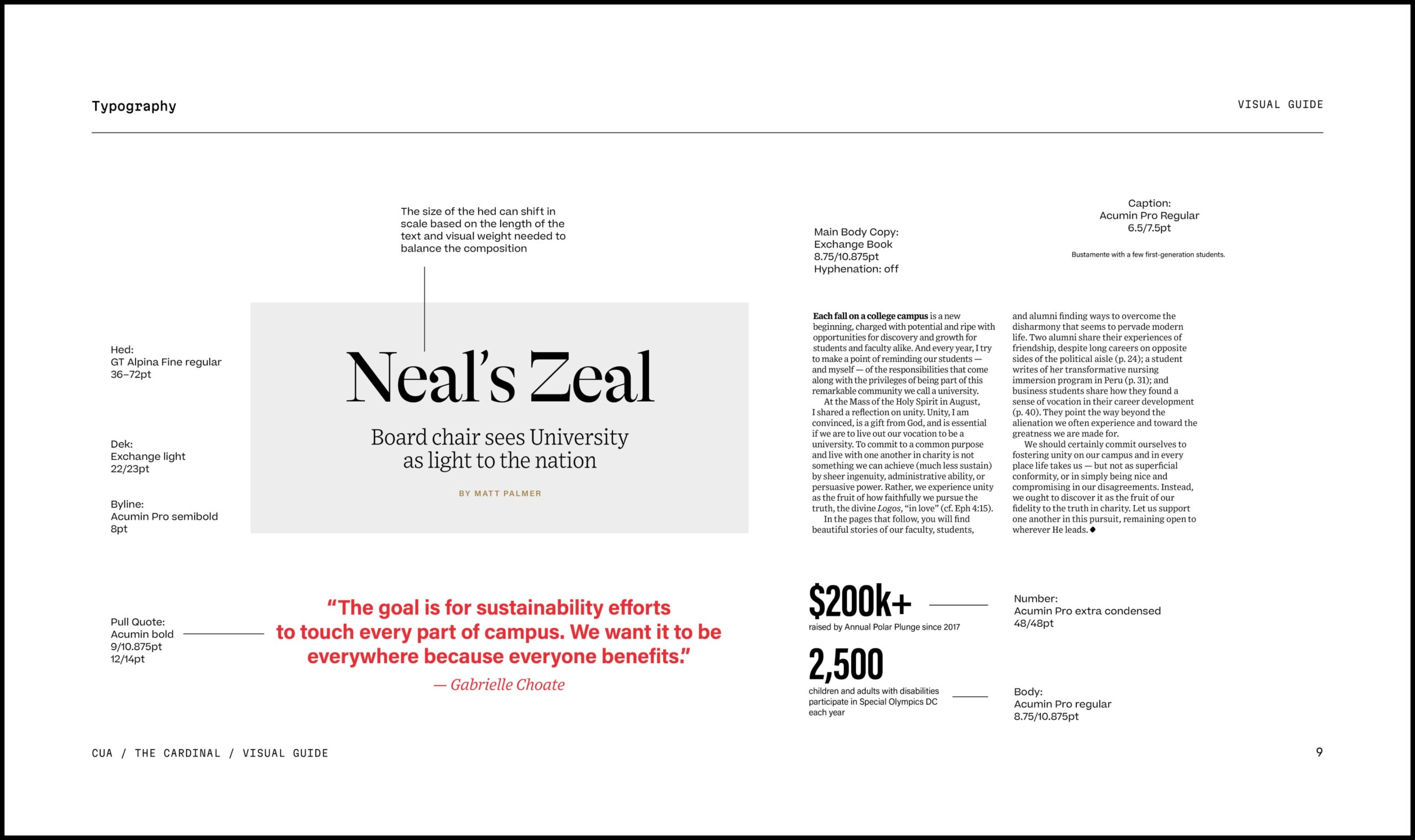
We broke away from the university’s brand type palette in favor of choices that better match the magazine’s editorial tone, setting a system for using different weights, sizes, and styles as a subtle way to organize content.
Type treatment can either serve as a striking visual note or as background, ambient music. It can shout or whisper. We chose to incorporate the university’s new type palette (determined by the rebrand) in subtle ways, but opted for a headline typeface that better matched the magazine’s new editorial tone—one that carried a bit more gravitas, a bit more shout, while remaining approachable. We limited our type choices for the sake of visual clarity and gave clearly defined usage rules. We set a system for using different weights, sizes, and styles of those types to subtly organize headlines, subheads, pull quotes, and body text.
COLOR
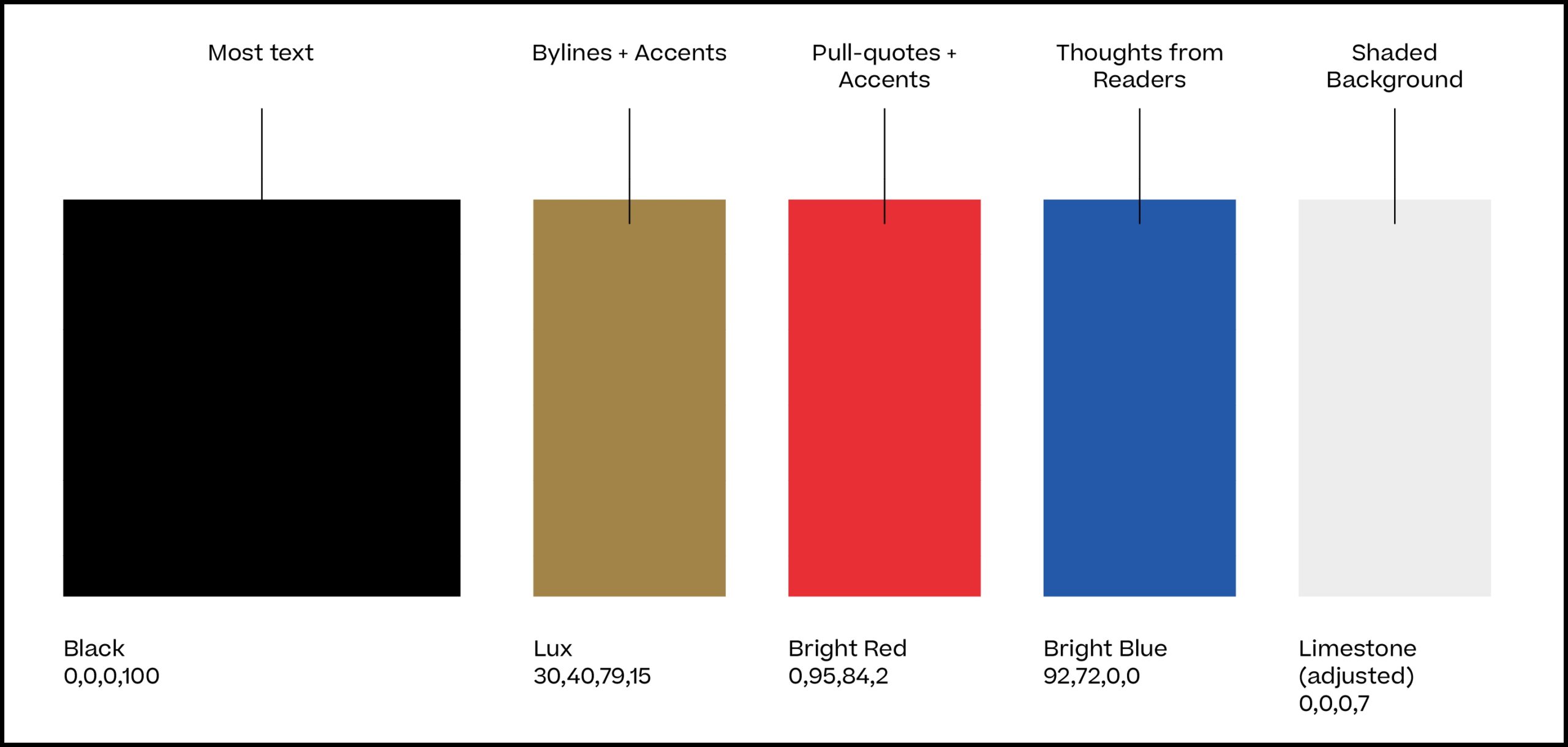
We created a guide for using color, limiting brand colors to small signals throughout the magazine.
In line with the brand-but-not-brochure philosophy, we limited brand color usage to small signals—to organize content, highlight features, or create atmosphere. For example, every pull quote is “Cardinal Red,” and “Catholic Blue” is only used in ads, to clearly signal ad content versus editorial. The color choices are intentional and enhance clarity.
GRID/LAYOUT
The grid is the invisible framework holding everything in place, and we believe a columned grid makes for consistent and efficient design. It’s tight in structure but flexible in use, able to be adapted for a variety of layouts across issues.
We created a gridded layout for The Cardinal, keeping in mind the need for generous margins and gutters to preserve white space and help the content breathe. We established predictable placement for sections like sidebars, captions, and pull quotes to give a sense of order while forming a template that’s easy to replicate from issue to issue.
Intentional white space provides editorial “breaks” to help readers avoid visual fatigue.
This intentional foundation-laying is particularly important for a redesign wherein we’re ultimately handing the reins back to an in-house design team, as was the case for The Cardinal.
VISUAL LANGUAGE
Visual language is the full system of these components that gives a magazine its particular “look and feel,” and clearly communicates an editorial concept. If that language is carried cohesively from issue to issue, a readership will feel like they’re experiencing a brand. Consistency builds brand recognition and emotional connection.
Toward that end, one of the greatest measures of success for us has been Catholic’s design team’s ability to execute the second and third issues of the magazine. We’re proud to have created something not only beautiful, but usable and sustainable over time. The result is a publication that retains visual cohesion from issue to issue while consistently reflecting The Cardinal’s editorial identity.
A magazine redesign isn’t just about making pretty pages—it should be strategic and intentional. And sometimes, it’s OK to take a step away to see things more clearly. That distance might be all you need for a fresh perspective.
Jodi Macfarlan is an editor at Journey Group. Although her prescription glasses might disagree, she’s found that a bit of distance often brings the sharpest clarity.