Going Native
The Challenge of Sponsored Content
By Michelle Russell
Run-of-book advertising is declining. Ignoring that reality is a path to the tar pits.
The late writer Michael Hastings once wrote, “I went into journalism to do journalism, not advertising.” As much as we would all prefer to just “do journalism,” many magazine editors like me have had to become creative about blending both.
While I’m not directly responsible for generating revenue, as the editor-in-chief of Convene, the magazine of the Professional Convention Management Association (PCMA), it’s partly my job to think up new editorial opportunities that enable our advertisers to tell their stories. Unlike traditional association publications, we straddle two media categories: We’re PCMA’s flagship magazine, but we’re also a trade publication with nearly 30,000 non-member subscribers. There are more than 10 magazines in our competitive set, all vying for the attention of our audience of professional event organizers and the dollars of our advertisers — the hotels, convention centers, destination marketing organizations, and other entities that support the meetings and events industry.
Competition for these dollars is fierce. And run-of-book ads are not nearly as easy to come by as they used to be. And so we’ve come up with several hybrid-content opportunities — otherwise known as native advertising content.
Engage Beyond the Page
Connecting with readers through workshops, contests, and tours
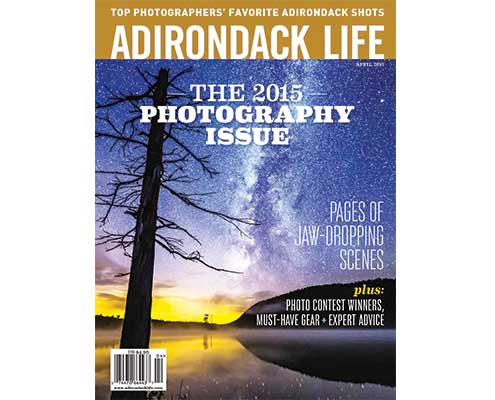
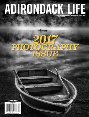
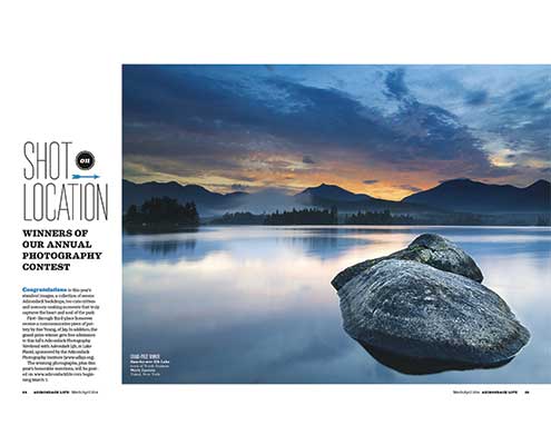
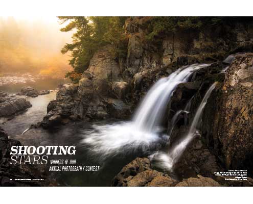
Photography — exceptional photography — is at Adirondack Life’s core, the beating heart of this regional magazine since 1969. It’s what longtime subscribers and casual readers alike tell us they love most — not the profiles of unusual characters, the descriptions of great hikes, the harrowing tales of backcountry misadventures. They want the visual cues that make a cherished place accessible even when they’re a thousand miles away.
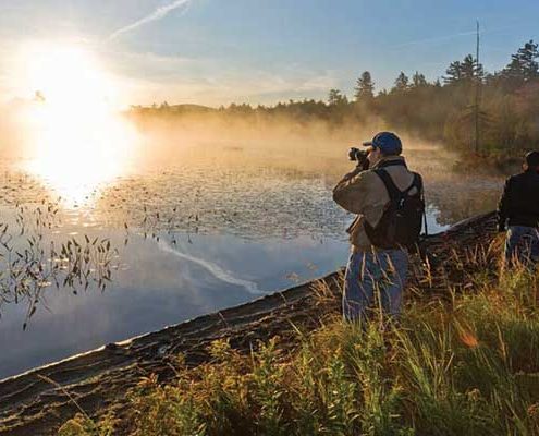
So, picture this: It’s 1:40 a.m. in a log lodge deep in the Adirondacks. Dozens of people are snug in their bunks beneath Hudson Bay blankets. A handful of others are drinking beer and listening intently as a renowned photographer regales them with tales of shooting in exotic places and scaling frozen peaks before dawn. “It’s all about being there,” he says. “f/8 and be there,” echoes an acolyte, quoting “Weegee,” the famous street photographer of the 1930s.
Foggy and beyond exhaustion, gathering empty longnecks, I catch the eye of Galen Crane, then our assistant editor, who feels he has to be the one to turn out the lights and tuck in the merrymakers. “Coffee and pastries will be on the table in four hours,” I say, “and the folks signed up for shooting at sunrise need to be on the porch at 6 o’clock.” No mass movement ensues, just a few more bottle caps pop off.
So went three years of Adirondack Life fall photography workshops, in which great regional photographers taught, critiqued, mingled, and made themselves accessible to rank beginners and talented amateurs alike.
Taking the Long View
The amazing result of planning a whole year
By Anna Seip
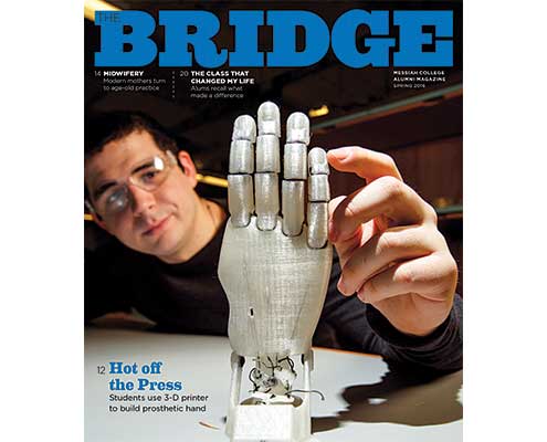
I couldn’t wait to work at a quarterly alumni magazine. As I became the editor of The Bridge at Messiah College in 2009, I looked forward to the slower, methodical pace of academia. The campus is idyllic, complete with a red covered bridge and a fly-fishing creek. No more cubicles for me. In my previous role, I’d worked as the editor of a monthly parenting magazine. Before that, I was a reporter at daily newspapers, cranking out stories as fast as possible. But now I’d arrived. I was joining the world of higher education. Goodbye to late nights and early mornings pulling together a back-to-school issue or baby guide. Goodbye to working on Christmas Eve. I was going to craft my stories and take my time, all while tucked away in a cozy office on the third floor of a stately building named Old Main. And then reality set in.
Summer 2017 Departments
Words & Pictures

By Claude Skelton
When I started teaching graphic design to undergraduate students, I had to dig back to the beginnings of my own training to recall basic design principles, particularly the vocabulary used to describe them. I’ve been a working graphic designer for over 40 years, and much of my designing had become completely intuitive. Terms like “positive and negative space” and “asymmetrical balance” are alive and well in my bank of visual literacy, even though I don’t consciously use those words. They’ve become second nature to me, but they are not obvious to students or even, sometimes, to clients. The best graphic design almost always relies on a handful of fundamentals, which I’ve synopsized here.
Going Native
The Challenge of Sponsored Content
By Michelle Russell
Run-of-book advertising is declining. Ignoring that reality is a path to the tar pits.
The late writer Michael Hastings once wrote, “I went into journalism to do journalism, not advertising.” As much as we would all prefer to just “do journalism,” many magazine editors like me have had to become creative about blending both.
While I’m not directly responsible for generating revenue, as the editor-in-chief of Convene, the magazine of the Professional Convention Management Association (PCMA), it’s partly my job to think up new editorial opportunities that enable our advertisers to tell their stories. Unlike traditional association publications, we straddle two media categories: We’re PCMA’s flagship magazine, but we’re also a trade publication with nearly 30,000 non-member subscribers. There are more than 10 magazines in our competitive set, all vying for the attention of our audience of professional event organizers and the dollars of our advertisers — the hotels, convention centers, destination marketing organizations, and other entities that support the meetings and events industry.
Competition for these dollars is fierce. And run-of-book ads are not nearly as easy to come by as they used to be. And so we’ve come up with several hybrid-content opportunities — otherwise known as native advertising content.
Engage Beyond the Page
Connecting with readers through workshops, contests, and tours
Photography — exceptional photography — is at Adirondack Life’s core, the beating heart of this regional magazine since 1969. It’s what longtime subscribers and casual readers alike tell us they love most — not the profiles of unusual characters, the descriptions of great hikes, the harrowing tales of backcountry misadventures. They want the visual cues that make a cherished place accessible even when they’re a thousand miles away.
So, picture this: It’s 1:40 a.m. in a log lodge deep in the Adirondacks. Dozens of people are snug in their bunks beneath Hudson Bay blankets. A handful of others are drinking beer and listening intently as a renowned photographer regales them with tales of shooting in exotic places and scaling frozen peaks before dawn. “It’s all about being there,” he says. “f/8 and be there,” echoes an acolyte, quoting “Weegee,” the famous street photographer of the 1930s.
Foggy and beyond exhaustion, gathering empty longnecks, I catch the eye of Galen Crane, then our assistant editor, who feels he has to be the one to turn out the lights and tuck in the merrymakers. “Coffee and pastries will be on the table in four hours,” I say, “and the folks signed up for shooting at sunrise need to be on the porch at 6 o’clock.” No mass movement ensues, just a few more bottle caps pop off.
So went three years of Adirondack Life fall photography workshops, in which great regional photographers taught, critiqued, mingled, and made themselves accessible to rank beginners and talented amateurs alike.
Taking the Long View
The amazing result of planning a whole year
By Anna Seip
I couldn’t wait to work at a quarterly alumni magazine. As I became the editor of The Bridge at Messiah College in 2009, I looked forward to the slower, methodical pace of academia. The campus is idyllic, complete with a red covered bridge and a fly-fishing creek. No more cubicles for me. In my previous role, I’d worked as the editor of a monthly parenting magazine. Before that, I was a reporter at daily newspapers, cranking out stories as fast as possible. But now I’d arrived. I was joining the world of higher education. Goodbye to late nights and early mornings pulling together a back-to-school issue or baby guide. Goodbye to working on Christmas Eve. I was going to craft my stories and take my time, all while tucked away in a cozy office on the third floor of a stately building named Old Main. And then reality set in.
Summer 2017 Departments
Words & Pictures

By Claude Skelton
When I started teaching graphic design to undergraduate students, I had to dig back to the beginnings of my own training to recall basic design principles, particularly the vocabulary used to describe them. I’ve been a working graphic designer for over 40 years, and much of my designing had become completely intuitive. Terms like “positive and negative space” and “asymmetrical balance” are alive and well in my bank of visual literacy, even though I don’t consciously use those words. They’ve become second nature to me, but they are not obvious to students or even, sometimes, to clients. The best graphic design almost always relies on a handful of fundamentals, which I’ve synopsized here.


