

Pages‘ Cool Cover: How’d You Do That?
A peek inside the process of developing and executing on a special cover treatment.
By The Pages Team
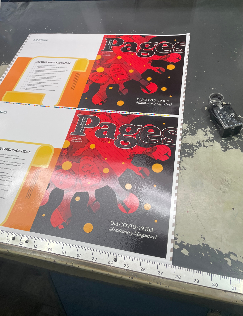
If you received our new issue of Pages in the mail (Fall’23/Winter’24), you might be wondering how we achieved the cool cover treatment—in some areas, a high, shiny gloss; in others, a rough, matte texture—with (we dare say), an impeccable registration between.
During production on Pages, our “magazine for those who love publishing,” we routinely consider whether the cover design lends itself to an interesting treatment. When designer Todd Verlander proposed this issue’s design, highlighting the inside feature, “Did COVID-19 Kill Middlebury Magazine?,” we knew it was ripe for a creative treatment.
Why? Largely, because the design itself is dramatic—red on black, with highlights of yellow. How could we play that up? And, because the design elements are large and distinctive enough to be sufficiently separated into gloss and textured areas, respectively.
The red area of the design is a riff on the “spiky blob,” that ubiquitous illustration by two medical illustrators at the Centers for Disease Control and Prevention (Alissa Eckert and Dan Higgins) representing the coronavirus that causes COVID-19. The yellow dots are the dreaded respiratory “droplets” that carry and transmit the virus.
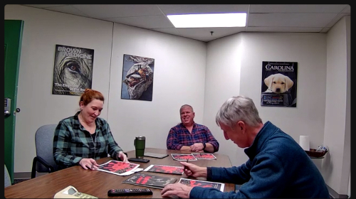
When our team met to review the design, we quickly decided on a high-gloss vs. rough texture, but we needed to determine which elements would get which treatment. After some discussion, we concluded that all red and yellow elements could be gloss; all black areas could be textured. In order to achieve this, we went back to our designer with a revision request: Could he move any yellow dots that were under- or overlapping any other element (the spikes, the letters in the masthead) to achieve full delineation of those elements? Easy change, and he was happy to oblige.
Here’s where things get fun.
When we typically produce a cover with matte vs. gloss contrast, the matte feel comes from the paper stock, while the gloss is achieved by applying spot UV coating. In this scenario, we order a special plate that effectively tells the press where to lay down the spot UV coating in a final step on the press.
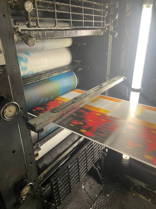
For this cover, we tried a different approach. We applied a “spot varnish” (not UV) coating to the black areas only. We did this within one of the standard units of the press, just like ink would be applied. Then, at the end of the print process, we applied a “flood coat” of high-gloss UV on the entire cover. When the high-gloss UV coating contacts the spot varnish, a chemical reaction occurs that results in the texture, which is known as “reticulated UV.”
There are a couple of nice benefits to this overall approach. First, we were able to create the press plate for the varnish in house, since it was a press plate as for any ink color. This speeds up the production process a bit. In the more standard process, applying a spot UV coating to certain sections of a cover design requires a special plate order wherein the UV blanket is etched with the shape of the image to be hit with the coating.
The second benefit is precision. It is the case that using a press plate to apply a spot treatment enables tighter “registration” (close match to design elements) over using a UV blanket to do the same.
This is not to say that one approach is categorically better than the other. It’s always a matter of the design of the piece and what you’re trying to achieve.
And that brings us to the big takeaway here: When you’re first considering a unique cover treatment, reach out to your Customer Success Manager to start talking about what’s possible. Early brainstorming and consultation can open up your options, particularly before your cover design is finalized. When we put our heads together, we can make great things!

