By Claude Skelton
When I started teaching graphic design to undergraduate students, I had to dig back to the beginnings of my own training to recall basic design principles, particularly the vocabulary used to describe them. I’ve been a working graphic designer for over 40 years, and much of my designing had become completely intuitive. Terms like “positive and negative space” and “asymmetrical balance” are alive and well in my bank of visual literacy, even though I don’t consciously use those words. They’ve become second nature to me, but they are not obvious to students or even, sometimes, to clients. The best graphic design almost always relies on a handful of fundamentals, which I’ve synopsized below.
When our studio redesigns or refreshes an existing magazine, we consistently use these basic design principles. Readers may or may not notice a change, but they will find the publication easier to navigate, more pleasurable to read, and worth saving from the recycle bin. We’ve found the following basics to be largely foolproof.
Encourage White Space
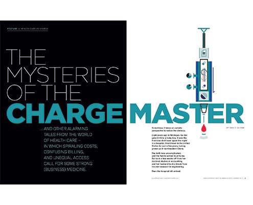
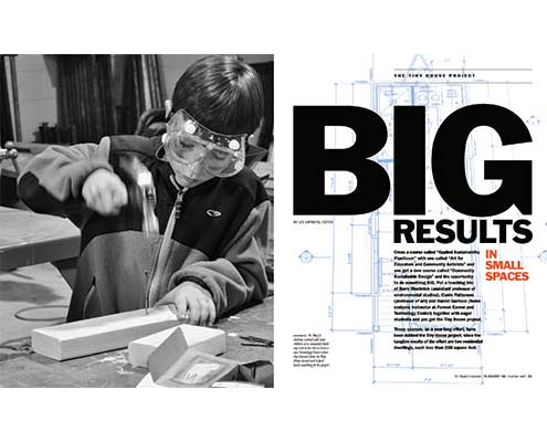
Avoid filling up every page corner to corner. Don’t automatically stretch out content or add gimmicks to fill space. White space provides relief to readers and can call attention to a page that otherwise gets lost in a monotonous flow. On feature openers, white space is an effective way to provide contrast with other text-heavy sections and to signal the story’s importance. For example, try to structure each issue so features begin on a spread rather than on a right-hand page, allowing plenty of room for a large image, a headline, a minimum of text, and space. On dense text pages, build in a wide top margin, or horizon, to run consistently throughout the publication. The added breathing room can then be used for heads, quotes, callouts, etc.
Create Contrast
Creating variation of elements, or contrast, throughout your magazine helps readers understand the flow of content and parse information. On pages of text needing visual relief, consider adding a large callout or quote in a bold and/or colored typeface. Subheads, drop caps, spot artwork, sidebars, and short profiles also provide entry points for readers and will break up long expanses of text. Feature stories gain prominence and visibility when they are intentionally designed to contrast with dense spreads containing news, departments, or alumni notes. Step back and look at the magazine as a whole to see if there is sufficient contrast, or pacing, between sections. Use variation in size, color, or complexity of elements as visual cues to signal where a section begins or to distinguish one section from another.
Edit Your Fonts
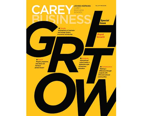
Try keeping font choices to a maximum of three or four typefaces (a typical typeface family includes roman, bold, italic, and caps). The best magazines have a consistent visual identity throughout; many achieve great results using only two typefaces (usually a serif and a sans serif) and employing scale, color, and/or strategic placement to create a variety of dynamic layouts (see examples at left). Magazines that use every font in their library — or try to change type styles with each feature — tend to look chaotic and unprofessional. If an occasional special cover or feature story needs to stand out from established typographic standards, consider “typography-as-illustration” created by a professional typographer or illustrator.
Use Professional Artwork
The artwork used in your magazine is a reflection of the caliber of your organization, with the potential to attract readers to your content and keep them engaged. Set aside a portion of your budget for professional photography and/or illustration, especially when it comes to covers and features. An investment in powerful, memorable images can more than pay for itself. When you have a great photo or illustration, let it command center stage — don’t overpower striking artwork with oversized headlines or other distracting elements. On the other hand, if you are given a terrific headline, consider pairing it with a small spot illustration or photo so the words are No. 1 in the hierarchy of your layout. Words and pictures work best together when they reinforce each other but don’t compete. Just as an editorial style is established for a publication, clear style guidelines for photography and illustration should be as well.
Ban Design Gimmicks
My (admittedly subjective) list of unnecessary gimmicks includes decorative borders, meaningless or overused graphics and stock icons, arbitrary color gradations, overuse of boxes or bands in multiple colors, ghosted photos or logos used as backgrounds, and bad photography “improved” with Photoshop techniques or filters. These gimmicks are too often poorly used as default design options and space fillers. Don’t use them.
Use Color Effectively
Often a magazine’s overall visual identity includes a color palette, a specified group of colors used to maintain a consistent “look and feel” from issue to issue. Principles of contrast and editing apply to color just as they do to words and pictures. Bright or warm colors can be used for emphasis or accents; muted or cool colors will recede to the background and can create a mood or tone. Color should compliment photos rather than distract or compete. Too many colors used randomly can create chaos and difficult reading, while a limited palette can add to the harmony and coherence of a magazine’s overall package.
Transition to Digital
I’m of the opinion that printed magazines and their digital counterparts are equally important, although their content is experienced differently. Even so, they should maintain a clear visual relationship, making it obvious that they come from the same source. Identity standards such as nameplate, color palette, typefaces, and graphics should be consistent in both mediums (or, given the limitations of some digital platforms, as close as possible). Words and pictures generally carry over from print to digital, however online content has other considerations worth noting:
Words — Just as in print, break up long-running text with oversized intro paragraphs, sidebars, and callouts to make stories easier to scan and navigate. Consider editing your content for the web, creating shorter stories or only including features, profiles, and news. Opt for an open source typeface from a library such as Google Fonts (to avoid online subscription fees and load time concerns). Font styles can be nearly identical to print-based versions, with fast load times and content indexing.
Pictures — Static artwork maintains consistency with the printed page while “web extras” such as animation or video can capture the attention of a broader (and younger) audience. If your budget is tight, consider subtle movement such as parallax scrolling or basic gif animation to add an element of motion.
Design Engaging Covers
Arguably the most important component of great magazine design is the cover. It’s what makes people open the magazine and leave it out on the coffee table. In a nutshell, the most successful covers are generally the simplest. A well-realized concept interpreted by superlative photography or illustration and a simple, compelling headline is all you need — good words plus good pictures. If more text is required, keep it small and unobtrusive. Achieving a stunning cover is never easy but always worth the effort.
Three basic elements make up most magazine covers: nameplate, headline, and image. So how do you find the magic balance of words and pictures to create a great cover? Here are some suggestions:
Nameplate — The nameplate is a given. It carries the identity of the magazine as well as that of the school. The nameplate design — its position, size, color, and typographic treatment — can make the difference between ho-hum and exciting covers. Too often the nameplate appears in the “newsstand” position — as large as possible across the top of the page — contributing to the sameness of so many covers. With magazines that don’t require the same visibility as newsstand publications, the options for size and placement of the nameplate become much greater.
Headline — Provocative stories and great writing lead to great covers. Headline writing is an art. Short is usually best, and clever wordplay is better — a good headline can generate great visual ideas. The best covers promise a good read inside by using smart heads paired with original visuals.
Image — Using photography, illustration, or typography, how do you create maximum impact with a single image in a relatively small space? Consider developing the headline first. Often a good headline can lead directly to a surprising, original visual approach. Sometimes, display type or a headline rendered as an illustration can be the most effective solution.
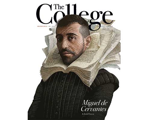
Since people and profiles are often subjects for covers, think creatively about making a portrait distinctive and meaningful. Find a photographer who specializes in working with people. If the subject happens to have a wonderful, expressive face, take advantage of it. Shoot on location if the environment has an important supporting role in the story.
Conceptual illustration can make a powerful cover, but it can be one of the most difficult solutions to implement successfully. Start by identifying an illustrator with a style that makes sense for the subject. There are few who can take an abstract concept and translate it visually. The best can take a story, even a rough draft or synopsis, and find creative visual solutions with very little art direction.
Finally, simplify, simplify, simplify. As good editing eliminates extraneous words, good design weeds out unnecessary visual clutter. Concentrate on making sure the words and pictures you keep are the best they can be.
Claude Skelton is creative director at Skelton Sprouls, a graphic design and branding firm specializing in higher education and the arts. Connect at tinyurl.com/linkedin-skelton.

