Our team caught onto something early in the project that proved critical to our success: Our opinions weren’t the ones that mattered. The input we needed to guide our new editorial strategy had to come from outside the building.
Crowdsourcing Questions – The Leader Survey:
- Out of the last four issues of The ASHA Leader, how many have you read?
- How much of each of the following sections of The Leader do you typically read?
- When you first receive your paper copy of The Leader, which of the following sections do you typically visit first?
- In your opinion, what kind of job is The Leader doing at covering the following topics?
- How interested are you in reading articles on the following topics in The Leader?
- How interested are you in reading articles on the following topics in The Leader? (different set of answer choices)
- How often do you visit The ASHA Leader Online?
- Do you use any of the following mobile devices in your professional role? (Select all that apply.)
- Do you use, do you recommend, or do you have an interest in apps designed to address any of the following?
- Regardless of whether you’re looking for a job, how often do you view the career section of The Leader or visit the ASHA Online Career Center?
- Have you ever applied for a job after seeing it posted on the ASHA Online Career Center?
- If no, why not? (Select all that apply.)
- What would prompt you to review job ads even though you’re not looking for a job? (Select all that apply.)
- How useful would you find each of the following features in an online buyers’ guide?
- Which of the following Certificates of Clinical Competence do you hold? (Select all that apply.)
- Do you work in private practice?
- Select the one type of building that best describes where you work all or most of the time.
- In what year were you born?
- Please use the space below for any additional comments on how The Leader, The ASHA Leader Online, or any other ASHA service can better meet your professional needs.
What Does the Crowd Say?
One association publisher uses crowdsourcing to give members a voice in its redesign
By Bridget Murray Law
When I joined the American Speech-Language-Hearing Association (ASHA) in 2011 as the managing editor of the association’s flagship publication, the time was ripe for change.
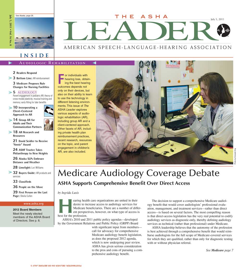
The ASHA Leader was a 48-page tabloid published every three weeks. The editorial tone was scholarly, with features written in the dry style of an academic journal (research citations and all) — an approach we suspected was off-putting to busy members seeking an accessible read. And the rest of the publication emphasized straight news — though with a three-week publishing cycle, the news was no longer news when The Leader dropped. The publication was simply missing the mark.
The association leadership recognized this and was ready to change the title’s voice and appearance to better engage our readers — over 190,000 audiologists and speech-language pathologists. Management assembled a team to execute this task, and it included me, our director of publications, our assistant managing editor, the Washington, D.C. design firm Bussolati, and the balance of The Leader staff.
Our team caught onto something early in the project that proved critical to our success: Our opinions weren’t the ones that mattered. We realized that our own recommendations to association leadership — based solely on our own opinions — would hold little weight. The input we needed to guide our new editorial strategy and to gain approval from leadership had to come from outside the building — from those who read The Leader every month.
To gather our members’ key input, we decided to lean on the concept of “crowdsourcing.” WIRED magazine editors Jeff Howe and Mark Robinson coined the term in 2005 to describe the then-burgeoning strategy of taking a function performed by a company and its employees and outsourcing it to a large network of people outside the company. The concept has been widely applied in areas like programming (e.g., open source code development), content development (e.g., Wikipedia), and crowdfunding (e.g., Kickstarter). For us, the concept was simple: We wanted to envision our entire membership as part of our redesign team. We wanted to “crowdsource” their ideas so that, redesigned, The Leader would reliably meet their wants and needs.
We determined that our main tools for gathering input would be online member surveys and the online metrics for The Leader content. We’d then augment this with stakeholder interviews and industry best practices. What follows is a closer look at how we used these methods to direct our new editorial strategy and design — both inside and outside the association.
ENSURING A GREATER GOOD
Our goal was straightforward and probably in keeping with the aim of most magazines. We sought more engaged readers. And we wanted to see this reflected in high online hits on our content, increased reader response to our advertisers, and continued demand for our magazine.
However, a magazine that is part of an association does not function in isolation. We needed to balance our desire for “sticky content” with our association’s organizational objectives and messaging. This can be a particularly tough balancing act in association publishing because these organizations have strong advocacy missions. Edginess and controversy may draw the most eyeballs, for example, but they can conflict with an association’s policy agenda. They can also alienate members who expect their magazine to be nonpartisan and inoffensive. We had to keep our association’s mission front and center.
We also needed to reconcile our internal departments’ visions for the publication. The science and research department, for example, liked the scholarly journal approach, and the policy department wanted highly technical pieces on legislation. Both approaches were evident in the current, tabloid version of The Leader, and we knew we’d encounter resistance to changing them. We’d have to navigate these challenges carefully.
SEEKING INPUT
To kick things off, I sought to get our team on the same page and thinking like our readers. We met for a series of brown bag lunches to discuss various magazine articles that moved us, everyone bringing something they liked to each meeting. We identified the commonalities: a clear, active writing voice; grabby, interesting topics; and strong, engaging photos. Armed with some baseline ideas about what makes an effective publication, we sought to confirm, deny, and augment these using the following tactics:
Member Surveys:
This was our opportunity to get direct input from our audience. The Leader staff had last conducted a survey in 2008, so by 2012 it was time for fresh input.
We asked 19 questions, many with space for open-ended answers. We sent the survey via email to 10,000 randomly selected ASHA members, of whom 2,599 responded (a solid 26-percent response rate).
So what did our members have to say? Overwhelmingly, they wanted better navigation in the magazine. We had been running a truncated table of contents on the cover, and readers reported having difficulty determining what to expect inside. Part of the problem was that article types — such as departments, columns, news bits, and features — weren’t clearly labeled and didn’t appear in a consistent, predictable order from issue to issue. Readers also expressed concern about the publication’s tabloid size, which some felt interfered with portability and copy-ability. Many members use The Leader when teaching undergraduate and graduate classes and said they’d prefer a smaller size to facilitate easy sharing.
Some of our statistical results:
- 26.8 percent of members said The Leader is relevant to their interests and is “very good.”
- 30.5 percent said overall design and content is “very good.”
- 22.5 percent said The Leader has influence on their practice decisions.
Translating these findings, we concluded that 70 percent of ASHA members didn’t love The Leader’s design and content. Definite room for improvement. (See sidebar for survey questionnaire.)
Internal Stakeholders:
Our next step was to interview internal stakeholders — association staff who provide and consult on The Leader content. Most of these staff members are audiologists and speech-language pathologists, our subject matter experts, so their input on the publication is critical. In a series of meetings, we asked them what they most wanted to change (or preserve) about The Leader. Many commented that the tabloid format was outdated and uninviting — too small to be a newspaper and too big to be a magazine. They thought there was too much text relative to graphics and illustrations. And regarding the three-week publishing cycle, many felt it left too much time between cycles to be newsy and too little time to go in-depth. Lastly, they suggested we update the design to look more modern, although they weren’t sure what that would look like.
Website Metrics:
It’s one thing to hear what people think. It’s another to observe what they do. Website metrics provide a treasure trove of information about readers’ activity. Observing this online behavior is essential to determining what readers want because it reveals where they go (and don’t go), what they read in part or in full, and what they choose to click. We used Google Analytics to assess our content, and the results confirmed what we’d suspected. Our members gravitated toward news they can use: clinical and administrative advice they could apply in their practice and research findings they could use in their treatment or teaching. In order, they most preferred: 1.) practice tips/trends, 2.) research briefs, and 3.) human interest stories. This, more than any other evidence, confirmed our hunch that scholarly-style articles written in academic journal style were not what readers sought from The Leader. It’s worth noting that ASHA produces many other resources for scholarly speech-language-hearing content, including its journals and Perspectives publication, all of which present academic and clinical articles written by members of the association’s special interest groups. The magazine could fill the need for a different kind of content.
Best Practices:
To round out our crowdsourcing findings, we considered industry best practices for content strategy and redesign by attending conferences and scouring blogs and articles from groups like Association Media & Publishing, Folio:, and the American Society of Association Executives. These pointed to the benefits of a monthly association magazine with simple yet eye-catching graphics and a direct, practical writing style.
RESETTING
With the knowledge and insight we gained through our crowdsourcing efforts, we were positioned to receive — and effectively assess — the recommendations of our design partner, Bussolati: Move to a monthly, 72-page magazine featuring increased use of white space, larger and higher-quality images, improved navigation, enhanced integration with social media, and a reduction in size from 10.5 inches by 12 inches to 8.5 inches by 11 inches.
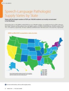
Given the extensive research we had done, Bussolati was able to propose specific editorial strategies that met now-identified readers’ needs. For example, creating a recurring one-pager called “At-a-Glance” featuring an infographic on a fact about our members. Visually engaging, easy-to-access content: check. And tying a two-color palette (pulled from each cover) into corner page tabs that run through the book. Improved, easy navigation: check.
Actionable ideas like these, coupled with our survey results, enabled us to make a very strong case to leadership. When they saw what members and stakeholders wanted — along with our mockups of the new design and editorial elements — they were wowed and jumped right on board.
Here’s a taste of the changes we made to our cover design, editorial strategy, and social media integration:
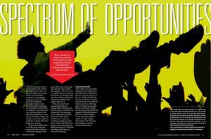
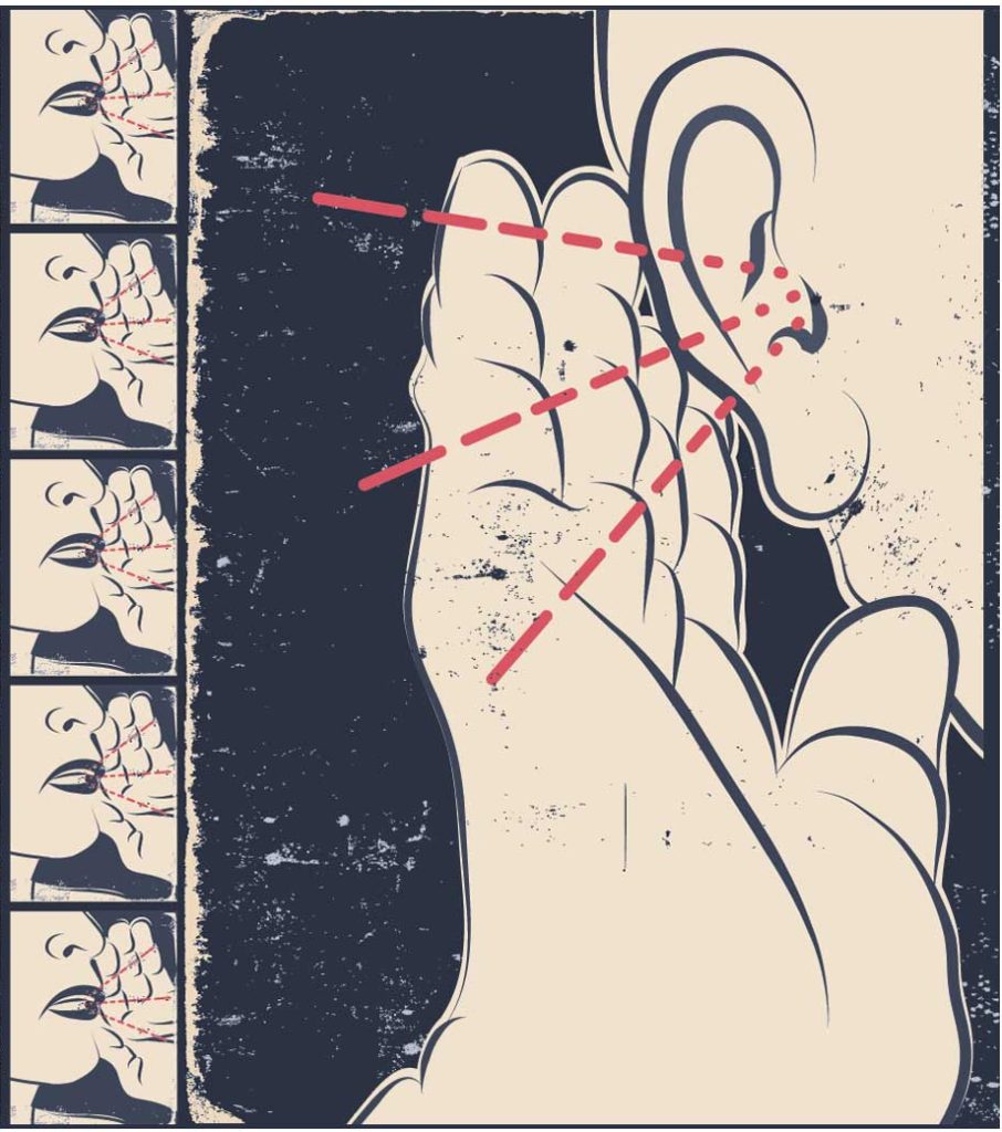
Cover — The cover is our first chance to make an impression with readers. We removed the abbreviated Table of Contents and dedicated the page solely to an eye-catching image and simple cover lines. We also decided to make each cover conceptual so it represents a feature story in an intriguing and eye-catching way. Our first cover in the new format — about the ability to speak despite being incapacitated — featured part of a young woman’s face with her eye half closed. We superimposed yellow lines and dots to depict speech and thoughts from her brain, coupled with the cover line “Freed Speech.” We believed a stronger cover would set the tone for our publication and attract more attention each month.
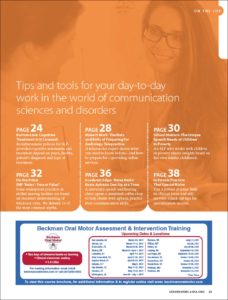
Editorial — We made significant changes in our editorial strategy in order to deliver a less academic, more utilitarian publication to our members. To meet their need for career and practical advice, for example, we added an “On the Job” section, which is a compilation of 700-word career advice columns written by our members. The section always appears in the middle of the book and highlights clinical strategies and tools to run a private practice. To help the section stand out, it has its own table of contents page, styled in the issue’s color palette. We also created a series of recurring columns and departments, such as “News in Brief,” “Research in Brief,” and “People,” all appearing in the same spots within the book.
To allay internal concerns that the association’s news might get buried in the new format, we created a consistently recurring section called “ASHA news.” We assured internal departments that clinical content is reviewed by subject matter experts so that even though the writing style is more reader-friendly and accessible, the content is always clinically sound and accurate.
While we now aim to make our news and department columns as short and digestible as possible, our features are longer so we can pursue a deeper dive and our readers can “lean back” for an engrossing read. To help our staff and writers effectively transition from a scholarly writing style to a journalistic one, we developed a set of writers’ guidelines and hold both member and professional/freelance writers to them (tinyurl.com/ashaleaderguidelines).
Social Media — Moving from a three- to four-week publishing schedule would take us farther away from being able to cover breaking news, so we turned to social media to fill this gap.
We started a blog, “The ASHA Leader Blog” (blog.asha.org), where we post three times per week. Posts are short (around 600 words), are typically written by members, and center on current news and practical advice. We also launched a Twitter feed (@ASHAleader) for the magazine, from which we tweet daily. As of February, we had 3,370 Twitter followers.
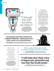
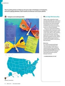
What really makes our social media strategy complete, though, is how we integrate it with the magazine. There’s so much important conversation and news happening on social media these days, we wanted to reflect that in the pages of The Leader. We instituted a “Blogjam” department in the magazine that features snippets from members’ own blogs. On Twitter and Facebook, we ask readers questions and run their answers in a magazine section called “Posted.” And we showcase a member’s Instagram photo each month on a page called “Glimpses.” Without fail, members post hundreds of photos each month with the hashtag #ashaigers, hoping to be selected.
TRACKING RESULTS
We relaunched The Leader in January 2013 and have received only positive feedback. That said, we wanted more than anecdotal evidence of our readers’ satisfaction, so we conducted a post-redesign reader survey in November 2013 at our annual ASHA Convention.
According to the results, over half of readers (56 percent) said they spend “a lot more time” reading The Leader. More than 90 percent reported that they appreciate the new emphasis on practical tips for their daily work, news and trends in the professions, and latest research findings.
But it was the comments they made in the open-ended section that really told the story:
- “I like the new look a lot! Keep a balance of research
and practical!” - “Appreciate the readability (cleaner writing style).”
- “Love the new format!!”
- “Variation of articles — human interest stories — excellent layout — good. Keep the research articles coming — makes me proud to be in this field!”
The positive trend has continued. We have significantly grown the number of advertisers in the book, from 20 to 27 percent since the relaunch. Online pageviews for The Leader articles have increased from just under 500,000 in 2014 to over 1 million in 2017. We can barely keep up with members’ proposals to write for the magazine. The ASHA Leader Blog has gone gangbusters: A post on the problem sippy cups pose to early development of oral motor skills reached over 800,000 people via Facebook in February. We plan to leverage that same author’s popularity by running a print feature this spring penned by her about cooking and autism. And we have proposed to leadership that it’s time to start thinking about our next redesign. Beyond any doubt, input from our members will guide the way.
Bridget Murray Law is editor-in-chief of The ASHA Leader. Previously she has been editor or consulting editor to Monitor on Psychology (American Psychological Association), Diabetes Forecast (American Diabetes Association), and Cleveland Clinic magazine, among others. Connect at tinyurl.com/linkedin-murraylaw.

