The Evolution of a How-To Feature
[Or, How to Do How-Tos]
By Lauren Davidson
There are hidden talents among us. Everyone knows how to do something, and many times those “somethings” are fascinating to others — which is likely why Pinterest and Tasty and the DIY Network have become all the rage. They have made it easier for the average person to share their skill, craft, or side hustle.
And while alumni magazines often tell the stories of particularly accomplished individuals in the pages of their publications, here’s an opportunity to feature a broader spectrum of alumni. Undoubtedly, there are many out there who could teach us a thing or two. So I connected the dots: Let’s find out what our Dickinson College alumni know how to do and get them to share. And what better way for me to present how I approached committing the entire feature well of one issue in Dickinson Magazine to a series of how-tos than to tell you in how-to format.
HOW TO PRODUCE A HOW-TO FEATURE
1. Develop the game plan.
There are several possible ways to approach features cast in this format, so first I had to settle on one. Do I generate a list of how-tos I think readers would enjoy and go after them? Or do I solicit reader submissions? We’ve had some very successful reader-response features in the past, and I thought organic, user-generated content would be most authentic and appealing, so I decided the latter would be the way to go. Let our readers be the drivers and see what happens. And knowing it would take some time to pull together, I slated this for the fall 2018 issue, giving me about a year.
2. Get buy in.
This is not your average alumni magazine feature, so a critical step is to convince the “powers that be” that it’s worth pursuing. I started with our Vice President of Marketing & Communications (my boss), explaining that how-tos are very on-trend and that this could be an out-of-the-box way to (1.) integrate alumni into our content in an unusual way and (2.) attract the attention of our readers when the magazines were in hands. I then presented the idea to members of the advancement team and the magazine’s editorial advisory board. The result from all parties was a resounding “go!”
3. Bring the design team on board.
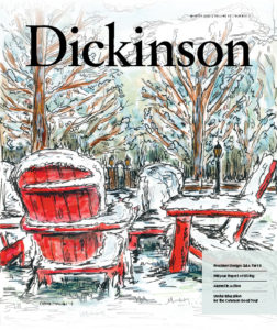 I’m fortunate to have a fantastic relationship with our Director of Design Services Amanda DeLorenzo, who is the lead designer on the magazine. She was as excited about this concept as I was (we’re both crafty and spend plenty of time on Pinterest), so we started brainstorming. We had discovered an incredibly talented alum on Instagram who does freelance watercolor art (and had recently done a print of a building on campus for a fellow alum), and I had enlisted her to illustrate the cover for our winter 2018 issue. Knowing this how-to issue was coming up, I asked her to document this cover-creation process so we could use her to promote the feature. (Side note: She nailed that cover art with a beautiful campus scene featuring Dickinson’s iconic red Adirondack chairs. The cover was such a hit, we created prints and notecards to sell in the college bookstore, but that’s another story.) With that starting point in hand, Amanda and I continued to collaborate on how to present the idea to our readers.
4. Put out the call.
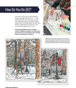 We ran the first call for submissions in the winter 2018 issue, in conjunction with our alum-illustrated cover. We dedicated a full page to promoting the submission opportunity and included photos of the artist working on the cover along with a link to our website where readers could learn about her process. The ad read:
“Some of the most popular YouTube and Google searches these days start with ‘How to … .’ ‘ In this Pinterest/Tasty/DIY world, sharing tips, tricks, and tools of the trade has become the trend. We know Dickinsonians are incredibly talented, and often those talents lay outside their major, profession, or field. So we’re putting together a how-to issue! Email dsonmag@dickinson.edu to nominate yourself, a classmate, a professor, or a staff member who knows how to do something worthy of sharing with the entire Dickinson community! To get the ball rolling, we asked Colleen Frerichs ’17, co-owner of It’s Our Side Hustle print shop, to document for us the process she used to create the stunning image you see on the cover of this issue. Check it out at Dickinson.edu/magazine.”
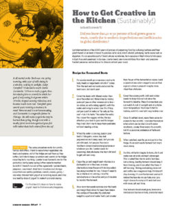
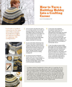
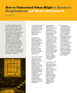
We also collaborated with our social media team to push the call on social media. As the issue landed, we got tons of love for that illustrated cover. Coupled with our fabulous full-page ad, I thought how-to submissions would come pouring in. We got three. On the positive side, they were completely different from each other and incredibly interesting. One was about how to turn a knitting hobby into a crafting career; another on the process of lactofermentation (preserving vegetables); and the third about how to fight urban blight. While we did not have strength in numbers, we had strength in topics. I saw that this wasn’t going to be as straightforward as I had thought — three how-tos was not going to fill our feature well. We needed more.
5. Edit submissions into consistent, step-by-step format.
Our past reader responses typically required minimal effort from the magazine editorial team — a light copy edit here, a minor revision there. I quickly discovered this would not be the case with the how-tos, perhaps because I had a particular vision in my head and because people aren’t used to writing in a step-by-step format. The original three came in more as pitches, with some narrative attached. Rather than putting the onus back on the alumni, I dug in, writing and re-writing the pieces, going back and forth with each author. I also saw that consistent structure would be necessary, and with very different topics and writing styles, that took a bit of finesse. I decided each how-to should be accompanied by a brief biographical blurb on the author, providing helpful background info and grounding their advice in a sense of expertise. There was also the matter of imagery. Two of the alumni had a wealth of images to accompany their pieces — not all were high res, and not all were usable, but it was a start. Alum No. 3 was only able to provide a grainy headshot, so we would need to come up with a way to visually represent his piece. After several rounds over several weeks, we (practically …) had our first three how-tos in hand.
6. Put out the call … again.
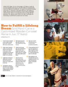
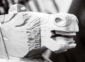
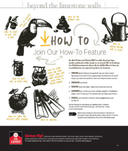 As noted in step 4, three how-tos does not a feature well make, so my designer and I came up with call-for-ideas ad No. 2. We had found some fantastic stock graphics, so for this second ad — another full-pager, this time in the spring 2018 issue — we brought in those visuals, and I wrote the call as a how-to (duh!). This was sure to grab readers’ attention and bring in droves of submissions. We got one. And it was another one that needed a lot of work, but it was a fantastic story about a hand-carved carousel horse that took 17 years to complete.
7. Fill in the gaps.
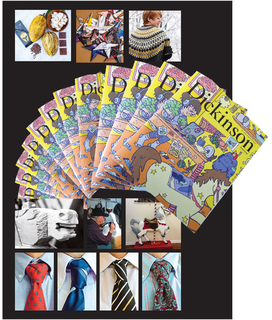
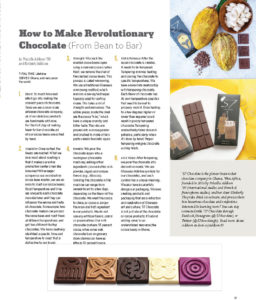
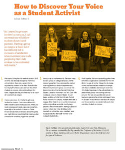
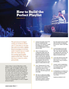
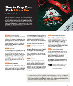
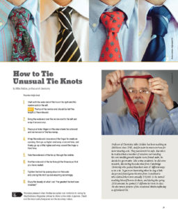
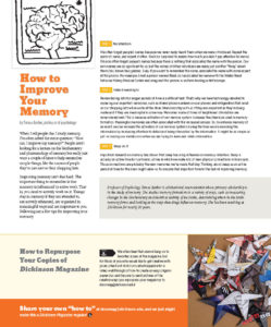
At this point, we’re approaching May. Our fall 2018 issue is just a few months away, so deadlines are looming and panic is setting in. I had 12 pages reserved for this feature well. Sure, we could have run with the four how-tos we had in hand and filled the remaining space with other content. But I wanted more, and I thought our readers would want more as well. I started contacting my other leads. We soon had a chocolatier signed on to contribute her steps to making a specific kind of chocolate and a DJ to tell us how to build the perfect party playlist. I also asked our student writer to come up with a student-written how-to. He found a friend to contribute a piece on how she found her voice as a student activist. I followed up with a member of our magazine editorial board, a comic-book writer. He signed on to provide a piece on how to craft a comic. I remembered seeing a Twitter account run by a Dickinson math professor who posted a #tieknotoftheday (yep, apparently that’s a real hashtag) and DM’d him. Turns out his necktie-knot expertise is extensive. Not only was he willing to contribute, we got him into the studio for a photo and video shoot where he walked us through his two favorite tie knots. I saw an Instagram post by our Office of Outdoor Education promoting a video shoot they were doing on how to pack a hiking/camping pack and got them to write out the steps in exchange for promoting their video. I read an article in the student-run Dickinson Science Magazine by a psychology professor who studies memory, and she quickly turned in a practical piece on how everyone can improve theirs. By the end of June, I had 11 Dickinsonians — alumni, faculty, and students — on board. We added a contribution of our own for an even 12.
8. Design the visual approach.
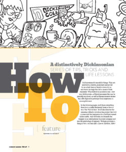
 Part of the original vision for the how-to issue included an[other] illustrated cover, but I wanted it to be created by a member of the Dickinson community rather a freelancer. So amidst all of this how-to hoopla, I put out a call on social media and in our daily on-campus email looking for illustrators. We got a great response to that (go figure), but one stood out as a great fit. She was a class of 2017 grad who had just completed a year on campus as a post-baccalaureate artist-in-residence and had a bright and quirky comic-strip style. She was quick to sign on, and Amanda and I put together a creative brief, proffering two possible approaches we had in mind and providing a list of the how-to pieces. She took the ideas and ran with them, sketching out a fantastic scene featuring elements from almost every one of the how-tos. Before we knew it, we had a cover unlike any we’ve had before. We used elements of it for the table of contents and feature opening, and, bonus, we asked the artist to provide a coloring page version of the cover, which we printed on the inside back cover. For the how-to images, we received more usable options from the contributors than we had originally anticipated. Some weren’t high res, others weren’t ideal, but they made each of the how tos relevant and personal. And, importantly, many of the images enabled us to show the steps, or parts of them, so we included as many as we could. After all, this would probably be our only chance to feature images of chocolate, yarn, wooden horses, neckties, and fermented beets in our magazine.
9. Produce, distribute, and gather feedback.
After nearly a year in the works, the how-to issue was finally finished. I was thrilled and terrified — not unlike with every other issue, but this one felt different. It was my vision, my idea — what does it mean if it’s a flop? If it’s a hit? If there’s no response at all? As with most issues, I received predominantly anecdotal feedback. I can’t count how many people have told me they loved the cover — that was a clear win. I had several calls and office visits from people who conveyed how great and different they thought the whole approach was. A senior advancement officer made a special trip to let me know he thought it was a triumph. One email from an alum stated simply, “The fall 2018 Dickinson Magazine is terrific! So much more than an alum mag!” Another alum wrote something that, given the other half of my job as admissions communications, was doubly meaningful for me:
“Thank you for the latest Dickinson Magazine. It seems to be improving over the last few years, but the last two have been the best ever. I read every page. I am planning on passing the fall issue on to one of my swimmers who is a high-school senior — I think she is really Dickinson material.”
I can say with confidence that I received more positive feedback about this issue than any other in my two years as editor of the magazine. At the end of the feature, we included a callout for additional how-to submissions with the proposition that if we received more, we’d maintain the how-to approach as a regular element in the magazine. So far we haven’t received any, but I’m still holding out hope.
10. Take stock of lessons learned.
I learned a lot from this how-to issue. I learned how to stay nimble and flexible when things don’t go as planned. I learned how to turn rough ideas or expansive narratives into concise step-by-step approaches. (After reworking the extensive narrative in one of our original submissions, the contributor’s response made my day: “In my submission, I purposely shied away from an itemized how-to list, thinking it would be impossibly long. Furthermore, I reasoned that anyone wanting to know the procedure for carving a carousel horse probably would consult a woodworker’s journal and not a college magazine. From my perspective, what you have cleverly done is to create a human-interest story, knowing that your audience will grant you the poetic license that it could be expressed in sequential steps.”)
I learned to make sure I have enough time and space to get things right, which has led to planning more issues and features farther in advance. I learned that I can play a greater role in guiding contributors to get to a stronger end product. I learned to trust my designer even more and allow her to go with her instincts — even if we end up changing directions entirely. I learned that the door is open and the support is in place for me and my talented team to take more risks. I hope the story of my how-to issue inspires you and your team to do the same.
 Lauren Davidson is editor of Dickinson Magazine at Dickinson College. After graduating from Elizabethtown College with a B.A. in English/professional writing, she began her career as an entry-level staff writer and worked her way up in the Office of Marketing & Communications. She is in her third year as editor of the magazine. Connect via davidson@pagesthemagazine.com.
Update: The fall 2018 issue of Dickinson Magazine earned platinum in the “magazines” category in the 2019 Hermes Creative Awards, an international competition sponsored by the Association of Communications & Marketing Professionals.

