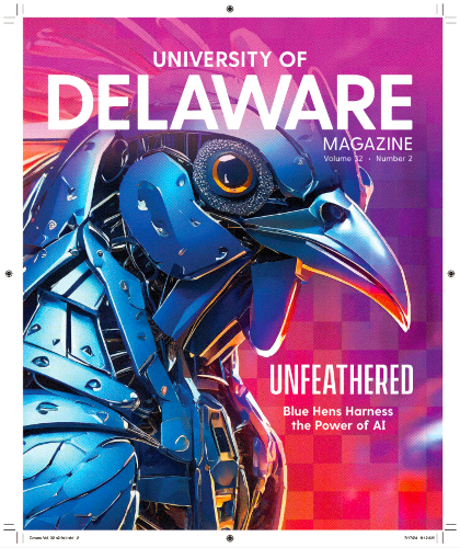
The University of Delaware cover art was created using Adobe Firefly for their AI-themed issue to invoke the spirit of machine learning, Blue Hen style. Modified for use with this article.
Have you ever wondered whether you should “go on press check” at your printer? And, if you’ve never gone before, what you’d look for when arriving press-side?
Technology has advanced so much that a press check is certainly not required to ensure a quality and color-accurate product. But, it can be a great learning experience for people unfamiliar with the printing process. And for designers and art directors schooled in color, it’s an opportunity to weigh in on the final color for your print project. We asked folks on both sides of the web offset printing equation (press checkers and press operators) for their perspectives on press checks and how to make them most fruitful.
MOLLY CHAPPELL
Director of Publication Design
University of Delaware
What is your background relative to print?
I’ve been working in graphic design since 1985. I came up through the standard roles—graphic designer to art director. Always with a focus on print. Now, I manage the design and production of University of Delaware’s alumni magazine and recruiting and admissions pieces.
Why do you choose to do press checks?
I go on press check for our most high-profile and most expensive publications. For example, we print 180,000 copies of University of Delaware Magazine, so that’s a significant investment. Press check is just that final step in the process to make sure everything is perfect.
“Do you think we should bring the magenta down here to get a better skin tone?”
What do you look for during a press check?
Color. Always color. We work to get things as accurate as possible during the prepress stage—ensuring that color is corrected, percentages are right, images are converted to CMYK—but there’s always that bit of play on press. And there’s how your proof translates to the paper you’re printing on. Primarily, I’m looking to make sure that people’s skin tones look right, that our brand colors are spot on, and that the saturation and vibrancy of color is optimal in the transition from our glossy Epson proof to press paper.
What’s your advice for someone going on press check for the first time?
Establish a relationship and mutual respect with the professionals running the presses. They have a ton of experience, and you can lean on that. I find it’s more effective to ask questions than to stipulate a specific change. I might ask, “Do you think we should bring the magenta down here to get a better skin tone?” I tell them what I’m after, and they’ll know what’s possible and how to get there.
What’s your favorite thing about press checks?
I learn something new every single time I’m in a pressroom, even after 40 years of doing this.

Cyan press plate
LISA CADIEUX
Owner/Designer, Freelance Press Checker
Liquid Studio
Your background relative to print?
I’ve been a graphic designer for 39 years and have had my own studio for the last 27. Right out of art school, I worked for a printer doing prepress prep, including stripping and plate burning. Then I worked as a production manager. I loved print from the get-go. I’ve been doing freelance press checking—on behalf of publishers—for over 20 years now because keeps me connected to what happens with my own design work for print, and it continuously educates me so I can explain the process to my clients. Today, it’s fairly common to work with designers who don’t fully understand the limitations of the press sheet, so I can bring that knowledge to the table.
What is your goal during a press check?
My job is to enhance or improve upon that transition from proof to paper. It’s about optimizing color given all of the variables—paper stock, ink coverage, design elements. When I come into the picture, I know the press operators have done their job. Any changes I ask for are subtle tweaks to color, most often for flesh tones.
What is challenging about press checks?
I’d say it’s maintaining a respectful balance of all the needs that are represented. There are the needs of my client and understanding their expectation, while also being respectful of the pressmen and factors they’re working with—with paper being a huge one. I have to decide how far I can push and what I can ask for based on the limitations of all the variables.
Your advice for a press check newbie?
By the time a project makes its way to the press, many decisions should have already been made to ensure optimal reproduction—especially with regard to design. For example, be wary of using visual elements that need to be matched across multiple signatures, like thick color bars or full-page color tints. It’s doable but creates a challenge.
Your favorite thing about press checks?
I love being in the pressroom. It’s the visceral experience of the smells, the sounds—and the collaborative energy that brings design to life on the page. It’s not just ink on a page. There’s so much energy that goes into it.

Magenta press plate
DARYL STORRS
Printmaker, Freelance Press Checker
Daryl V. Storrs Artworks
Your background relative to print?
I’m a printmaker and pastel artist. Primarily, I make woodcut prints depicting Vermont landscape scenes. When I was earning my master’s in printmaking, my emphasis was on lithography. I printed using only yellow, magenta, and cyan, with the image on Bavarian limestone. This gave me a strong foundation in color. I’ve been doing freelance press checks for 12 years now.
Your goal during a press check?
My goal is for the press sheet to match the proof, but there are factors to consider. The proof is a close approximation, and you have to be able to understand how to compare that to the actual printed page. For example, the proof paper is different in color than the actual paper on press, and this can affect the color of the images. Another critical issue is registration. The fact that the paper is moving through the press and stretching can affect the fit of images and colored type. I work closely with the pressmen to make sure everything is registered and looks sharp.
What’s a challenge of adjusting color on press?
Oftentimes, it’s a compromise. If you make a color adjustment for the sake of one image, you need to understand that this change may impact what’s “in line” with that image on the same press sheet. If you’re adjusting something that’s part of a crossover, you may need to make the same adjustment on another sheet to match. If you want to take down the black somewhere, that could affect the type on the same sheet. You need to consider the ripple effect of any change you want to make.
Your favorite thing about being in a pressroom?
Well, pressrooms aren’t typically the cleanest places. And they’re certainly loud. But, I really enjoy the people. That’s my favorite part.

Yellow press plate
KENNY SANTOR
Head Pressman
Lane Press
Your background relative to print?
I’ve been working in the pressroom at Lane Press for 43 years; 37 as a head pressman. I started when I was 19 years old. My grandmother worked for Lane before me—and, as it turned out, my wife’s grandmother did, too.
In what ways are press checks beneficial for publishers?
It’s hands-on. When customers know what they want—whether that’s brand colors or flesh tones or the color on ads—we’re there to get it just right for them.
What can be changed during a press check?
Color. During make-ready, we’re working to match the proof and to compensate for variables, like the fact that proofs tend to have a slight color tint or that different types of paper absorb ink differently. I make adjustments based on my experience, and then the customer can assess and weigh in.
How do you adjust color on press?
On the cover press I operate, there are a large number of “keys,” or segmented blades, that deliver ink to one-inch segments across the sheet. I can adjust any of the four colors (CMYK) with each of those keys. That’s a remarkable amount of potential variation. But it allows me to make subtle changes to get color just right, or to meet a customer’s preference. And although it’s complex, it’s second nature to me. I do it all day long.
“Be picky about your paper.”
One piece of advice for a publisher?
Be picky about your paper. A high-quality gloss paper prints the sharpest dot, so print reproduction is very sharp. As you move toward uncoated paper, the sheet absorbs more ink and you get a less sharp dot. So it’s about the look you’re trying to achieve. And be aware of whether your paper has a color tint to it—some have a red tint, for example. You want to know that going into a press check so you understand how that tint impacts your color.
Your favorite thing about your job?
I love to print. I love putting out a good product and knowing customers are happy with what I do.

Black press plate
MIKE LEDOUX
Head Pressman
Lane Press
Your background relative to print?
I’ve been working in the pressroom at Lane Press for 43 years; 40 of those as a pressman. I started when I was 18, right out of school—first as a stacker, then roll tender, then pressman. I’ve been a head pressman for about two years now.
In what ways are press checks beneficial for publishers?
Everyone sees color a bit differently. And everyone has something that’s most important to them—whether that’s skin tones or brand colors or color screens and borders. So, the press check is an opportunity for a customer to fine tune color where it’s important to them.
How do you adjust color on press?
I run a text press that prints sheets of eight pages each, front and back. Color is controlled by a computerized, automated system called “closed-loop color,” which essentially brings the color up to a standard reading. From there, I can adjust the color to select parts of the sheet, or the whole sheet, by changing it incrementally on the press monitor.
“Everyone sees color a bit differently.”
What’s a challenge with adjusting color on press?
One challenge that can arise is if a customer wants to see richer or more saturated color, but they’re printing on a paper that can only take so much ink. For example, uncoated paper soaks up a lot of ink, and there’s a limit to how much you can increase the color and ink density before you run into problems, like streaking. So, sometimes it’s a conversation about what’s possible to achieve with a particular paper stock, combined with the design at hand.
One piece of advice for a publisher?
One simple thing I see is body type that’s created as a “screened four-color type”—where the color is made up of partial percentages of CMYK—rather than as solid black. When customers ask if their type can be darker or richer, it’s usually because it’s screened type rather than 100% black. This is an easy thing to change for optimal print.
Your favorite thing about your job?
I get to do so many different things throughout my day. I don’t stand in one place, and I don’t get bored. Running a press means doing a bit of everything.

