

Please Don’t JUST REDESIGN Your Website. Please!
A real strategy will serve you better now — and in the future.
By Alissa Levin
I‘ve noticed in my work with independent magazines that their digital presence is frequently out of step with their print publication. There are two reasons for this: money and fear.
On the money front, it’s easier to justify budgets for print because the channel leads more directly to subscription and ad sales. Most websites are not part of that selling model. And fear? Small magazines often don’t know where or how to begin — especially when their current site looks and feels far behind current best practices. It’s overwhelming. And while it DOES take time and an initial investment to update your publication’s website, the onetime cost will pay for itself exponentially. Your website is the selling platform for your print publication. These days, most if not all prospective readers will refer to it (and your related social media platforms) before deciding to subscribe. First impressions really do matter as they lead to longer-term engagement with all of your organization’s offerings.
I also find that many publishers miss out on the opportunity offered by a website redesign. That is, you can (a.) simply update your look and feel, which is what many do, or (b.) execute a strategic redesign. The latter is more than a makeover. It’s a deep look at your priorities and goals. It’s about understanding the role your website can play, in concert with your other platforms, to enhance your brand and drive readership.
An alternate headline for this article could be “On the Couch,” as the process of successfully redesigning a website can be a lot like therapy. There are fears of the unknown and anxiety about how successful the outcome will be. The goal of a good designer is to help quell the fear, and even help you embrace it as you work together to develop a design strategy that will transform the way your website supports your overall publishing efforts.
Why Redesign?
In my experience, there are three reasons to embark on a strategic website redesign.
To strengthen your brand. A defensible objective is to share and promote a change in the direction of your publishing efforts. Perhaps you have expanded your content offerings, changed the frequency of print, or altered the tone or emphasis in your editorial. A redesign is the ultimate opportunity to define (or redefine) and strengthen your mission and brand. If nothing drastic has changed in your organization, consider a redesign — or at minimum, an in-depth discussion about goals and priorities — every three to five years.
To expand your audience. An effective website doesn’t thrive in isolation. It’s part of an ecosystem of channels — social media, digital newsletters, website, print publication, and live events — that work together to reach and attract new readers. A critical part of the redesign process is assessing whether or not you have a complete ecosystem and how well it’s working. And then to do something about creating or improving it.
To leverage better technology. It’s probably been too long since your last redesign or update from a technology standpoint. Consider these questions: Is your site is a series of Band-Aid fixes and outdated technology? Does it run off your larger organization’s platform, with attendant restrictions in terms of publishing capabilities? Is your site “responsive,” meaning it works seamlessly on desktop, tablet, and phones (essential for an effective social media strategy)? Over half of all web traffic now comes from mobile, and this number is increasing rapidly. Most importantly, does your website looks outdated? If so, your organization will look outdated and out of touch by association. Remember that your site is the first stop for many new subscribers; consider it the “shingle” you hang outside of your virtual door to inspire users to come in and look around.
Get Strategic
There’s more than one way to go about redesigning a website. Our methodology at Point Five stems from our extensive work with small, independent publishers. We take a four-phase approach that includes strategy (the most creative and collaborative phase), information architecture (the practical application of the answers arrived at during strategy), design (bringing the architecture to life), and development (utilizing technology to construct your website). The most critical phase for achieving a strategic redesign is, not ironically, the strategy phase. That’s the one we’ll focus on here.
A good strategy lays the foundation for a project and, when done properly, ensures its success over the long term. This phase is where the difficult questions get asked and must be answered. This includes the most basic and yet most challenging questions: What is your brand? What do you stand for? What makes you different? Why should readers care? What do you offer them that they can’t get anywhere else? Answering these root questions (while sometimes surprisingly difficult) is a necessary step toward fine-tuning your message. A crystalized brand and finely tuned message form the secret sauce that drives the most successful and effective website designs.
People assume that the design phase is the most creative part of a redesign project, but it isn’t. It’s this strategy phase. This is when designers get a broad view of the project, a look at the big picture. It’s when we listen to the ideas and goals of editors and publishers. We ask: Imagine your site is finished. What are your visitors doing? What articles are they reading? What is their experience like? Together as a team of editors, designers, and developers, we begin to envision how to organize and structure the new site. And when we assess the visual consistency among an organization’s assets and channels — from the print magazine to newsletters to ads, social media, and collateral — visual ideas begin to take shape.
The Long View
The very first task of a strategy phase is to review all of your content — all the material that could conceivably live on your website. It’s akin to spreading your print issues out on the table. You need to be able to understand everything you’re dealing with before you can solve the question of how to organize and present it in an effective hierarchy.
We like to start this content audit by looking at a year’s worth of a magazine’s issues. We look closely at the table of contents, dissecting the magazine’s components and thinking about how they could each translate to a digital platform. We also look at non-print content components (e-newsletters, podcasts) and any other materials created by the organization (press materials, events, annual reports). An Excel spreadsheet is a great tool for organizing all this material.
The redesign is a prime opportunity to organize your magazine’s content differently than you may have elsewhere. You’re not beholden to the structure of a print magazine with set departments, columns, and features. There is no need to organize by “print” versus “online-only.” It is often more valuable to your audience to organize your offerings by concepts or subjects.
Strategy is also the time to examine the relationship between your print and digital products. How do they complement each other? How can you maximize your digital redesign to improve your print publication? The rich media capabilities of digital can bring print ideas to life using staged video, streaming videos of live events, podcasts, animations, and virtual reality. For example, a publication can broaden its reach and audience by introducing a video series that reinforces existing content in a more immediate, tactile way. Both platforms, print and digital, should have the same goal of strengthening your message and brand. The redesign is an opportunity to leverage what each does best.
Here are three recent Point Five case studies that demonstrate ways to leverage a comprehensive and thoughtful strategy phase.
COMMONWEAL
Commonweal magazine has been in continuous publication since 1924. Their mission remains the same as when they started: To provide a forum for civil, reasoned debate on the interaction of faith with contemporary politics and culture.
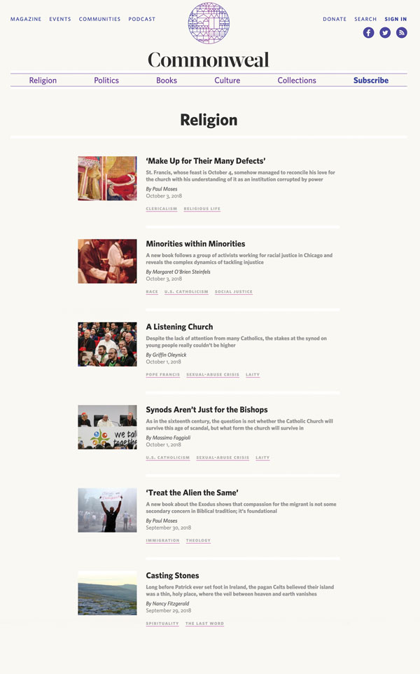
Commonweal approached us for a redesign because they believed their site didn’t match how they viewed themselves. They report on current affairs, and they wanted a site that looked relevant, both culturally and politically. The original site crammed as much information into as little space as possible, abiding by the old mentality that everything needed to be “above the fold” or it would be lost. They needed to highlight the culture and politics content on their site that was getting lost in the visual clutter.
In the redesign, we embraced open space and eschewed the false (but tempting) obligation to fill every inch. White space allows the reader to easily take in all the headlines and quickly parse the available information. As a result, readers pay more attention to the content and readily get the essence of the publication — smart, respectful, engaging, interreligious dialogue — all of which reinforces Commonweal’s messaging and brand. We also embraced vertical scrolling to air out content and accommodate longer pieces. Today, technology users don’t mind scrolling and swiping; it’s second nature.
TRICYCLE
The Tricycle Foundation is dedicated to making Buddhist teachings and practices broadly available. Founded in 1990, the organization produces a collection of offerings: a quarterly publication (Tricycle: The Buddhist Review), a film club, an e-book series, online courses, video teachings, and discussions with contemporary Buddhist teachers. These offerings are at the core of their brand, which informs and enlightens the Buddhist community.
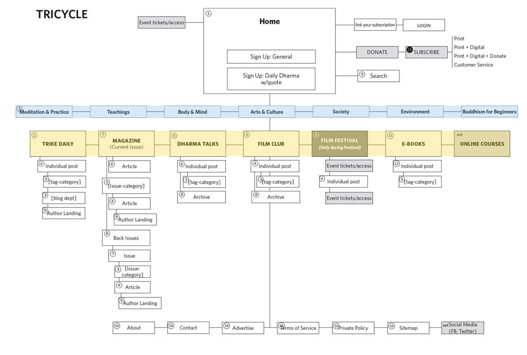
Tricycle needed to organize all of their offerings — or “subdivisions,” as they call them — under one roof. They wanted to make it clear to their visitors that they are not just a magazine; they also offer all these other multi-channel products. Each subdivision needed to stand on its own but also work together to create a unified, cohesive look for the whole organization. Our structural solution was to create navigation that contained each of the offerings, while simultaneously including a cross-channel list of content topics. We wanted to show the topical through lines connecting the subdivisions. And by adding these main topics to the navigation (Arts & Culture, Body & Mind, History & Philosophy, Meditation & Practice, Society & Environment, etc.), we instantly give the reader an idea of the subject matter available on the site.
Our design solution included using a series of icons and associated color palette to distinguish each subdivision of the site (Trike Daily, Magazine, Dharma Talks, Film Club, E-Books, Online Courses, and Podcast). The icons work as additional navigation on the homepage as well as on article pages and flexible modules throughout the site.
DEMOCRACY: A JOURNAL OF IDEAS
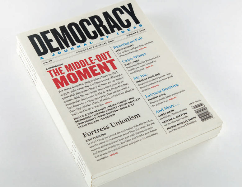
Democracy: A Journal of Ideas was started in 2005 to offer progressive perspectives on American foreign policy and politics. The story of their redesign is about creating a consistent look across both print and web. The print journal itself is unconventional because there’s no graphic art in it. The design focuses exclusively on typography and color, emulating the look of a broadsheet political poster.
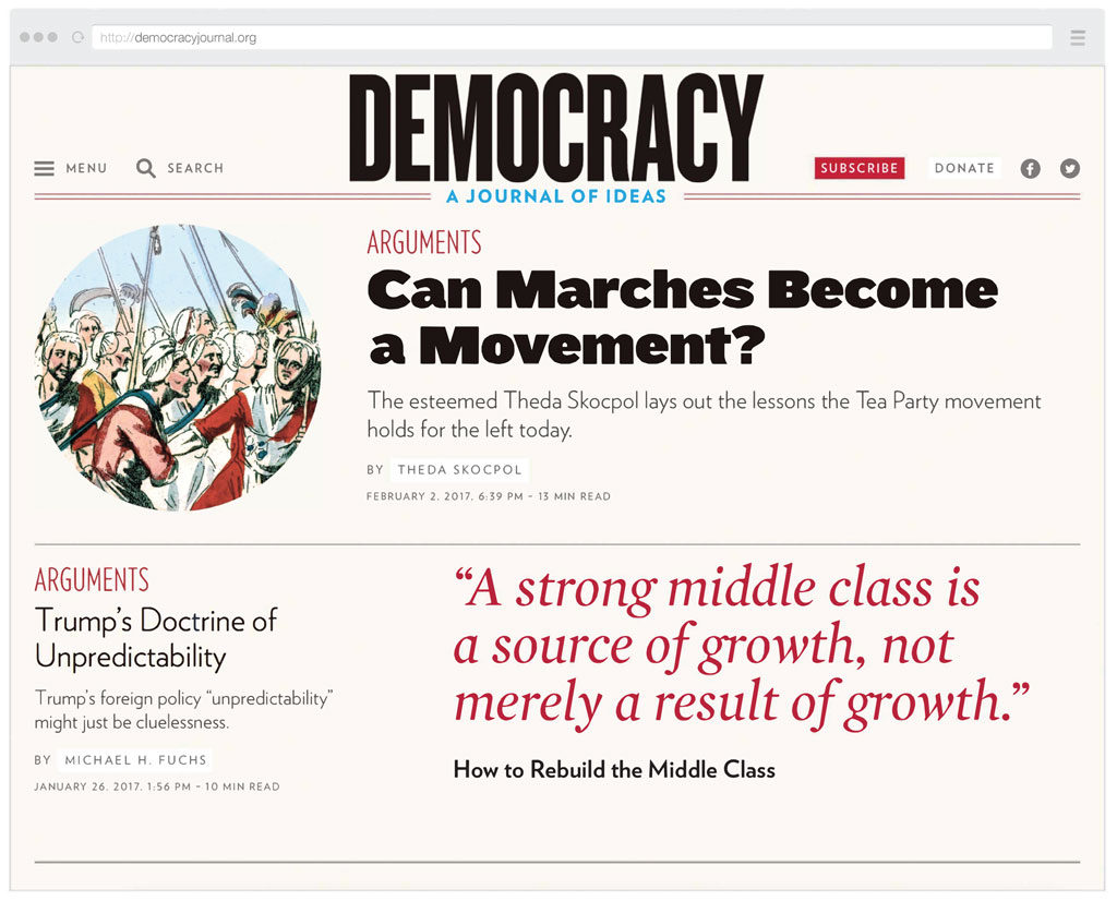
When we designed the print journal and original website in 2005, 13 years ago, websites were narrow and the selection of typefaces was limited, making it difficult to mimic the look of the journal online. By 2016, with the presidential election coming, the editors wanted a responsive website in order to effectively participate in the political conversations that were happening across social media.
The most dramatic new feature of the redesigned site is the typography. With the new site, we were finally able to take advantage of an important technology that had not been available 13 years ago — webfonts — to extend the brand we had established with the print magazine over a decade earlier. Using the same typefaces that we use in print enabled us to bring that same bold voice to the web. We also coded the new site to be “responsive,” meaning that the scale and weight of the typography, as well as the images, change based on the proportions of the user’s device. This gave us the freedom to explore scale and a variety of the font weights, allowing for movement and drama on the screen. We also expanded the width of the site from 795 pixels to 1056 (some sites are as wide as 1200 pixels) to provide a larger canvas for information and white space.
Mapping Forward
As part of your strategy phase, plan for future initiatives. You may want to consider adding rich media, such as videos or podcasts; new channels or guest columns; or things you simply can’t afford in phase one. Include these in your strategy discussions so you can pave the way for seamlessly adding them in the future. This approach enables you to fully leverage the work of the strategy phase, providing you with a roadmap for next steps. And when you have trouble making an architecture or design decision, come back to the big-picture clarity and plan established during strategy.
As you embark on the strategy phase for your own redesign, remember the beauty and advantage of the web: It’s constantly evolving and improving with advances in technology. By taking advantage of this, you have the opportunity to strengthen your magazine’s brand message and improve your user’s experience. Don’t avoid it. Embrace it.
Alissa Levin is founder and creative director at Point Five. A graduate of Rhode Island School of Design, Alissa started her career at the Santa Monica Museum of Art and launched Point Five in 1997. Connect via [email protected].


