Oh, Why Not?!
Go ahead. Upend your university magazine.
By Maria Henson
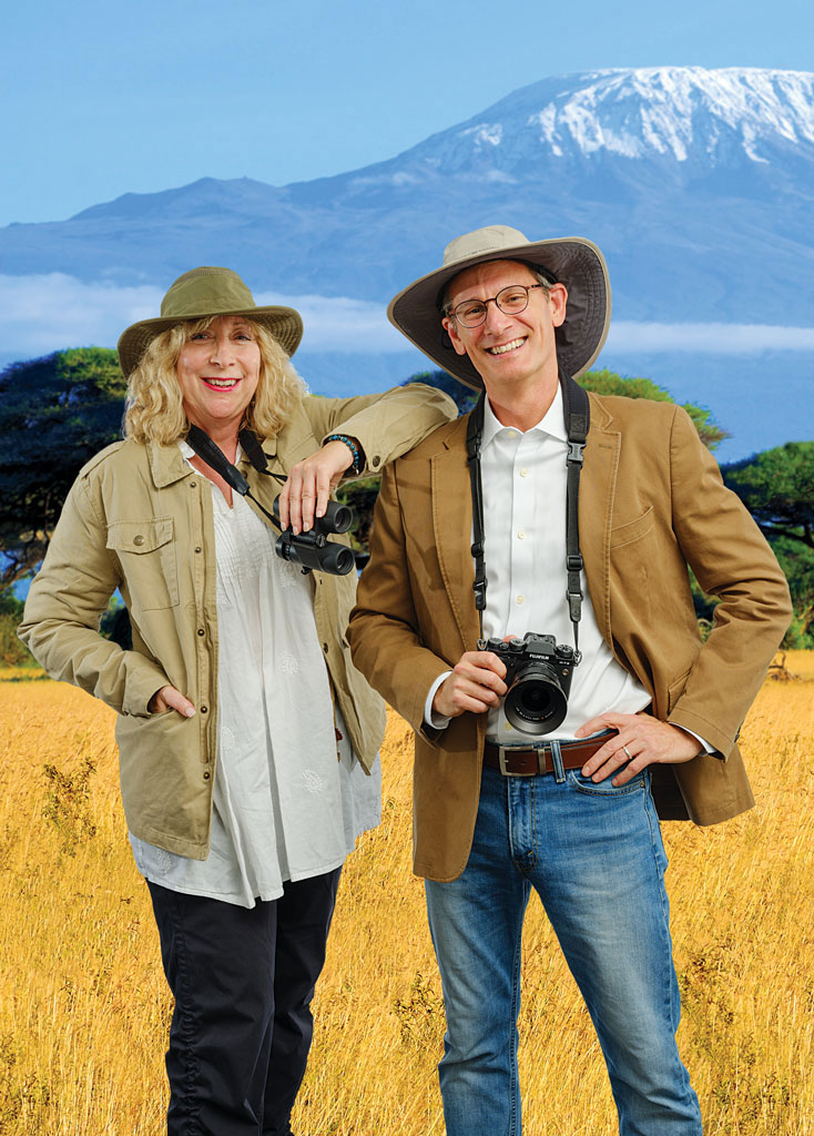
My story starts in a tent in Africa. How was it that I found myself with a piece of canvas separating me from the lion roaring in the distance and the hippo snorting and munching on grass inches from my head? What had happened to that teenager I once was, content to parade through Raleigh, North Carolina, shopping malls on the fashion hunt, calling it entertainment?
In 2008, I took a leap from a newspaper career that had led me all over the country for more than 25 years. It’s true I always was an adventurous traveler (post-shopping-mall years), but I had also followed the rules for the career ladder. I had worked my way up at various newspapers, from general assignment reporter to statehouse reporter to Washington correspondent to investigative editor and, at The Sacramento Bee, to deputy editorial page editor. My notion to request a yearlong sabbatical from The Bee to move to Botswana to volunteer at the University of Botswana and at safari lodges seemed crazy, yet my heart told me to go. I had fallen madly in love with the place on vacation the previous year, and my driving question was “Why not?”
And that’s where Wake Forest Magazine comes in.
The adventure in Africa led me back to The Bee (then back to Africa) and eventually, in 2010, to my alma mater in Winston-Salem, North Carolina. My new job was to oversee Wake Forest Magazine — and by last-minute chance — to teach journalism. But … gulp … I had only a couple of weeks to prepare for teaching, not to mention zero magazine management experience. Let’s just say I found side-stepping black mambas and Mozambique spitting cobras not nearly as frightening as both jobs at the start.
But again I asked, “Why not? Why not take the leap? And, furthermore, why not do the unexpected with Wake Forest Magazine?” These questions fueled me along the way, and I figured failure couldn’t compare to finding a cobra near your foot (which actually happened). I hope those of you wondering about whether you can overhaul your magazines can take heart from my story. I am fairly certain you are starting from firmer footing than mine.
Blazing a Trail
What I found at the magazine was a devoted, talented team that believed in high standards for writing and editing. They had won multiple awards for content through the years. When I came on board, there were three of us on staff. The magazine came out four times a year.
But despite the quality of content, there were challenges. The magazine boasted a tiny budget and only two weeks for design work before each issue went to press. The paper stock was slick and flimsy. We had lots of cooks in the kitchen as administrators looked over text before publication. The content seemed too heavy on dry news items about administrators, faculty, and donors. What to do?
In retrospect, I treated those early days like a newspaper investigative project and also relied on my experience as an alumna who had been the typical crazy-busy professional with little time to read Wake Forest Magazine beyond class notes. The questions I considered in my first months on the job: What was the history of the magazine? What would my perusing 10 years of magazines and talking with my staff about their challenges and triumphs teach me? What were our resources? What was our budget? (A pittance.) What did my boss, the vice president of University Advancement and a cabinet member, expect? Would he find money for an overhaul? How could the magazine compete for our readers’ time and attention? Could I maintain some sense of independence and journalistic standards in running the magazine? What could the magazine become? Who could help?
Inspired by these questions, I, my teammates, and my vice president, Mark Petersen, took on the revamping of our magazine. Upon reflection, we loosely followed David Allen’s Natural Planning Model. He’s the author of “Getting Things Done: The Art of Stress-Free Productivity.” His time-management method for clarifying goals, planning projects, and charting progress is:
- Identify the purpose and principles. Why are we doing this?
- Envision outcome. What will it look like if we are wildly successful?
- Brainstorm action steps. How will we accomplish it?
- Organize action steps. When do we do these things?
- Identify next action. Where do we start?
Mark, the team, and I define our purpose and “why” with the magazine this way: We believe in Wake Forest and want to nurture community. Our respected managing editor Cherin Poovey, who retired in April after 33 years at the university, described it in more detail: “We seek to tell powerful stories of Wake Foresters doing good and doing well — in their local communities around the world — in the spirit of the University’s motto, Pro Humanitate (serving humanity). We want to affirm the institution’s values and goals; inform by telling stories of alumni, students, faculty, and staff; and surprise and delight with editorial content that is visually and editorially vibrant.” While the team has never veered from its long-standing goal of nurturing community, we decided in my first weeks on the job that we wanted to change the magazine’s look and content. The question was how.
To me that meant doing my research — interviewing Maureen Harmon of Denison Magazine about her advice for creating an excellent magazine, taking notes about Kenyon’s stellar work (and many others’), exploring survey results from the Council for Advancement and Support of Education (CASE) about alumni publishing, and delving into Pentagram’s alumni magazine design successes. I piled up stacks of visually-rich magazines such as Orion, Fast Company, and Garden & Gun for inspiration about what it would look like if we were “wildly successful.” I spent a lot of time amid the magazines at Barnes & Noble and the campus library.
I learned from the CASE survey of more than 35,000 alumni magazine readers that magazines “are one of the most effective ways to connect with, engage and motivate alumni and other constituents.” Those first national survey results, released in March 2010, also stated readers’ preferences. Alumni preferred class notes and stories about athletics and institutional traditions, for example. They were least interested in stories about fundraising, donors,
and faculty publications.
Mark and I wanted to steer Wake Forest Magazine in a direction focused more on alumni than campus-centric news. He says, “When we set out to do this [overhaul the magazine], we were thinking about the audience — what was most important to them. We really wanted to create a magazine that was about them and for them — and in many cases the stories are written by various alumni (and) a lot of the photography is by alumni. So, it’s an inherently authentic interpretation of Wake Forest through the eyes of those who love it.” Changing “the frame of reference,” as he calls it, made it easier to explain to people in the administration why the magazine needed to be different from the typical institutional marketing piece.
There are no subscriptions or alumni fees for the magazine. We print 86,000 copies and send them free of charge to alumni of the undergraduate and professional schools, faculty, parents, and friends of Wake Forest. In that spirit, Mark and I wanted the magazine to be considered a gift. We wanted them to open each issue, as Mark says, “with giddy joy.”
After a few months the team, with Mark’s backing, decided on a phase-in of a redesign led by freelance designer Julie Helsabeck. She has an innate and exquisite sensibility for editorial design. She guided us smartly through a wish list. Yes, we could have an anchored philanthropy page or spread for donor stories. Yes, we could be more experimental and colorful visually, including in class notes. Yes, we could have a fresh masthead and identity.
We knew we wanted different paper stock, and our printer worked with us to find the right recycled paper to support our environmental values. I wanted something akin to Fast Company’s stock then, with texture and heft, and we got it. Note to all: Do not scrimp on paper.
New Path, First Steps
The new Wake Forest Magazine debuted in February 2011. We
went from four issues per year to three to maximize our budget.
Mark secured the money for us to create a more robust magazine
and, eventually, a website. I asked for and received a budget that would allow me to hire not only Julie Helsabeck for ongoing freelance design work but also alumni writers and nationally known illustrators and photographers.
The budget hurdle would have been impossible if not for Mark. From our earliest conversations about what might be possible, he supported making the investment to improve the magazine. Wake Forest was embarking on its biggest capital campaign in the university’s history; he had financial support from the trustees to ramp up University Advancement’s endeavors for a successful campaign. He envisioned the magazine as the premier publication for connecting alumni to the university. As the CASE survey results showed (and I shared with Mark), the more time alumni spent reading an institution’s magazine, the greater their depth of engagement with the institution.
We wanted to create a magazine that alumni would hesitate to put in a recycling bin. We wanted them to keep it on their coffee tables, not only because they were proud to be Wake Foresters, but also because the magazine had more stories they wanted to read.
The first issue of the phased-in redesign featured the new paper stock and more visual storytelling. The second introduced our new masthead. For that issue, atop a cover photograph of our baseball coach and one of his players were, coincidentally, the words “The Gift.” The “gift” in this case referred to Coach Tom Walter’s kidney, which he had donated to the player. (That story possibility had given me chills, setting off my “spidey sense” and a must-have-it plan.) Part three of the redesign occurred in the fall; we changed our binding from saddle stitch to perfect bound to enhance the overall quality.
It’s important to mention that in 2011 Wake Forest hired a team from a nationally acclaimed graphics design company in Winston-Salem, led by Hayes Henderson, to create campaign and marketing materials with fresh branding. Although Hayes and his group work in another part of University Advancement, he began collaborating and continues to collaborate with the magazine team as creative director, suggesting just-the-right illustrator at the perfect time and offering consistently astute guidance for our visual storytelling. For a few years, two of his designers worked on spreads for us, too, alongside Julie. Today our magazine team numbers four, and Julie is sole designer, still freelancing.
Not a Map, a Compass
Alumni responded to those early changes exactly as we had hoped. I received calls and emails about how much they loved the new paper and magazine. Enthusiastic messages began with such proclamations as “A tour de force!” A few years after the redesign, a consultant interviewed 100 alumni about their myriad experiences with the university. Without prompting, they brought up Wake Forest Magazine as their main source of information about the university and without exception praised it.
Wake Forest University President Nathan Hatch told me last year, “The great thing about the magazine? It’s not just focused on the interior of Wake Forest. It’s the broad Wake Forest community. It asks what interesting things are our graduates doing? … It’s revealing dimensions of Wake Forest that people aren’t aware of — important things that aren’t on the surface.”
I cannot overstate the role Mark Petersen played in the magazine’s evolution. Mark trusted my instincts to change the kinds of stories in the magazine and the way we told them. He gave us freedom to experiment and performed the magic necessary to persuade the other members of the cabinet to give the magazine freedom and room to exercise independence. No one directed us to do stories or interfered with content, although technically Mark has always had the last word. It’s been a delightful partnership, seeing how we can unearth great stories and tell them well. The key was building trust that we were professionals whose devotion to Wake Forest and its Pro Humanitate ideals would be clear in the publication; in other words, the proof was in the pudding.
To this day the power of “Why not?” carries us through selecting our themed issues, story ideas, photography, and design. Here are a few examples of how that has played out:
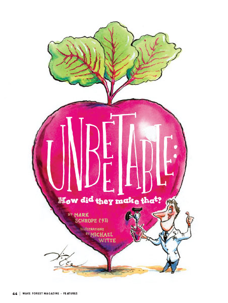
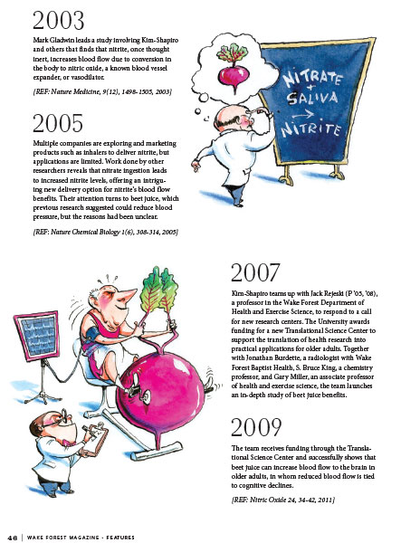
— We have university scientists creating a beet juice for brain health. Why not tell the complicated scientific story through an illustrative, time-line approach? So we did.
— Why not model a story on journalist Ken Fuson’s notable feature published in The Baltimore Sun years ago called “A Stage in Their Lives” about the making of a high school play? At Wake Forest, we had staff member Kerry King report over 74 days the soup-to-nuts student production of Shakespeare’s “Love’s Labour’s Lost” for a major feature story.
— Why not take that fun Twitter account that links to historic letters, @LettersOfNote, and do a Wake Forest version? We found a trove of marvelous letters in the campus library’s special collection and hired a local collage artist to bring the letters to life. (As @Letters-OfNote says in its descriptor on Twitter, “Letters! Like Tweets but papery.”)
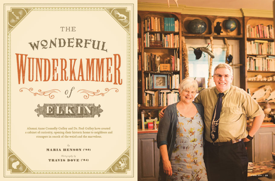
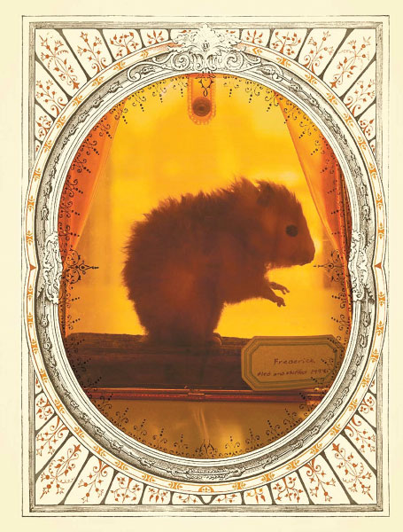
— Why not feature a photograph of a dead hamster in an orange purse? After all, it hangs in the wunderkammer of an alumni couple in Elkin, North Carolina. The couple — a doctor and an artist — were the only people in North Carolina to open their home to strangers for Atlas Obscura Day, honoring the world’s most curious and awe-inspiring places. We paid a visit.
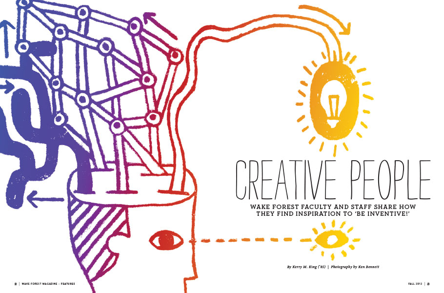
— Why not model a Wake Forest Magazine issue on Fast Company’s annual edition about innovators? We featured our faculty innovators, including a creativity professor in the entrepreneurship program who, thanks to the photographic treatment, appears to be levitating.
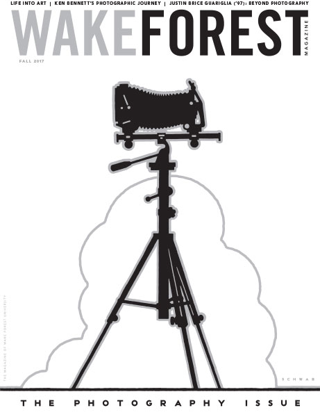
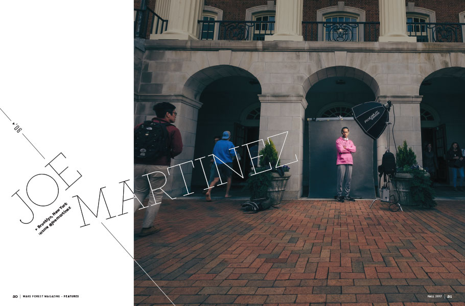
— Why not assign a theme for one issue, “The Photography Issue,” by inviting alumni professional photographers back to campus to photograph something (anything) that reflects their view of Wake Forest?
— Why not, as we did for spring 2018, prepare a community issue that features more than 40 Wake Foresters photographed together in the university’s Wait Chapel with the resulting image laid out in a gate-fold? What sparked the idea? Adam Ferguson’s giant fold-out photograph in The New York Times’ special section in March 2017 titled “Fleeing Boko Haram, Thousands Cling to a Road to Nowhere.” The single photograph spans four complete pages and depicts roughly 100 people who had fled the terrorist group and were waiting for food in the desert in Niger. The annotated photograph, according to The Times, aims to convey the scale of the crisis and to humanize those in its grip. I thought we might adapt the aim to a positive story in Wake Forest Magazine.
In 2010, I would never have imagined that alumni magazine inspiration could arise from a photograph of people fleeing a terrifying Islamist militant group. I now know better. I have learned much in my job — thanks to my wonderful teammates and colleagues — most of all that ideas abound, and stories abound. We need only pay attention to our “spidey sense” for a kind of kinesthetic confirmation about what’s possible, rally our defenders, and find the will to take the leap.
Maria Henson is associate vice president and editor-at-large at Wake Forest University, where she oversees Wake Forest Magazine and teaches journalism. She won the Pulitzer Prize in 1992 for an editorial series about domestic violence and edited a series by Tom Philp about the Hetch Hetchy Valley that won a 1995 Pulitzer Prize. In 2012, Wake Forest Magazine received the CASE silver award for most improved magazine and has since garnered 19 other CASE awards. Connect via henson@pagesthemagazine.com.


