Design: Is There Such a Thing as Plug-and-Play?
What happens when an art director goes to implement a packaged redesign … on the oldest magazine in North America? Consultant and art director Carol Moskot shares her uniquely inside view.
By Carol Moskot
Five years ago, I hopped on a plane to my hometown of Toronto for a meeting with the editors of the 190-year-old United Church Observer, North America’s longest continuously published magazine. I was there to discuss their plans to rebrand.
Editor and publisher Jocelyn Bell and consultant Sharon McAuley had written a roadmap for repositioning the magazine, and I was submitting a proposal to produce a visual redesign that would reflect this new direction. If awarded the work, I would supply a complete redesign “package” that would be implemented by an as-yet-hired art director (and one-person art department). My 16-page proposal outlined my process and approach in three phases: discovery, design, and development. Shortly after the meeting, I was selected for the job.
Over the next few months, I FedEx’d several boxes to the offices of the United Church Observer. Each contained a phase of the redesign mounted elegantly on foamcore. Via Zoom, I presented the visual rebranding—the magazine’s look and feel, typographic approach, and page design systems—along with detailed instructions for an assigning budget that could be easily executed by the incoming person. The visual design reflected the magazine’s new editorial voice and received unanimous approval from the United Church of Canada’s general council. As the project came to a close, I was thrilled to be handing over the magazine’s zipped InDesign templates and fonts, along with brand guidelines, for the future art director.
Except, that art director turned out to be me.
I’ve been redesigning magazines and newspapers in the U.S. and Canada for the last 30+ years. Before starting my consultancy, I’d always been brought on board to both redesign and lead a magazine art department. When Jocelyn wondered aloud if I’d ever consider taking on the role of art director in addition to being the project’s consultant, I jumped at the chance (and challenge) of putting my redesign to the test.
Soon enough, though, a seemingly endless stream of questions began to race through my mind.
How was I going to communicate regularly with a remote staff? And how was I going to simultaneously fill the roles of designer, production coordinator, and prepress associate?.
But wait, I told my panicked self, I deliberately designed the magazine to be plug- and-play from the start. The irony was not lost on me. Would I—could I—follow my own recommendations as outlined in my detailed proposal for a magazine with a staff of one while staying on budget, sticking to deadlines, and art-directing a magazine located a country away? Today the magazine is known as Broadview, and I’ve been its remote art director for the last five years, a veritable art direction and design team of one. I’m here to share what I’ve learned in the process of creating and implementing a turnkey redesign, including the do’s and don’ts.
BACKGROUND
The United Church Observer, an independent nonprofit publication affiliated with the United Church of Canada, was positioned for 190 years as a “voice for enlightened Christianity serving mainly the United Church membership.” By 2019, though, the Observer was experiencing attrition of its paid subscription base due to an aging United Church membership and a decline in church attendance. At the same time, the Observer’s digital users and page views were increasing significantly. Nonmembers were going to the website for its more broadly appealing content related to socially progressive topics. It was clear to the team and leadership that there was an emerging audience to engage, and the challenge was to do so without alienating the existing one.
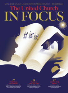
Jocelyn and Sharon’s solution was to create a whole new magazine concept, a risky thing to do with a publication that’s been around for nearly two centuries! The task was to come up with a new name (Broadview), an updated tagline (Faith, Justice and Ethical Living), and a fresh visual approach that would appeal to this broader audience. At the same time, we would create a separate and distinct section within the magazine targeted to the original readership. This inside section would be uniquely branded The United Church in Focus, a name carefully chosen to echo the previous, long-standing one. A magazine within a magazine. Familiar, yet distinct.
REBRANDING
My experience redesigning magazines for thought-leading and faith-based organizations has made me keenly aware of the demands of content-driven, ambitious projects for a unique audience. I was therefore happy to find that our three-day redesign kickoff meeting at Jocelyn’s kitchen table made use of commissioned research. The findings helped us build a readership profile that defined our new target audience’s characteristics (lifelong learners, people of faith), values (equality and inclusion for all, concern for the environment, belief in the importance of charitable giving), and reading habits (consistently engage in stories about human rights and social issues, human interest and inspiration). This profile was key to helping us define the types of content, topics, tone, and editorial voice for the new magazine.
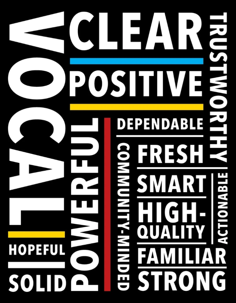
When it was time for me to design the visual embodiment of our new approach, I mined this thinking for key brand words that distinctly defined the magazine’s persona, visual identity, and voice. It’s an exercise I do with every publication consult/redesign with great success.
Every decision was reflective of the brand words. They literally became the measure of every design choice.
The brand words for Broadview that quickly surfaced were: solid, strong, vocal, clear, powerful, fresh, dependable, positive, smart, high-quality, hopeful, actionable, community-minded, familiar, and trustworthy.
Each time I presented an area of the magazine’s new design to the editors—logo, cover strategy, typographic choices, navigation, page design—I’d explained how every decision was reflective of the brand words. They literally became the measure of every design choice. Going forward, any future art director could use them the same way, ensuring that design decisions weren’t made on a whim.
The end result was a visual redesign that reflected the magazine’s purpose: To be ideas-driven and to get to the heart of a given subject with sophistication, intelligence, and inspired curiosity.
IMPLEMENTATION
Then came the ultimate test.
It was a cold and wintery November, only weeks after being hired, and we began planning our May launch issue. This is where I’d take that redesign plug-and-play package I’d created and implement it. I’d have to shift my mindset from that of a design consultant who had a very exacting vision of how to execute the redesign of a magazine brand to that of an art director who needed to synthesize this redesign and learn how it bumped up against actual execution.
How’d it go?
Well, here’s the truth of it: Consultants have the luxury of time to plan with intention. Art directors are faced with dynamic shifts and challenges that arise during the tight squeeze of deadlines. This demands flexibility and knowing how much you can push a design framework without breaking it. Here are three particular challenges we encountered wherein I needed to do this—and what I learned along the way.
 CHALLENGE #1: What happens when a cover concept doesn’t go as planned?
We had a strong lineup for our launch issue. And given that we would have a large newsstand presence, it was important that this and every cover carried a punch. It would need to be conceptually driven with an image, photographic or illustrative, and equally strong and emotive typography to reflect the magazine’s new voice.
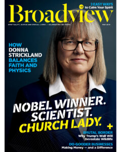
The challenge was that our cover subject, a Nobel Prize-winning scientist and devoted (and self-proclaimed) “church lady,” was overbooked with travel and lectures and unavailable for our photo shoot. At stake were 37,000+ print copies along with special newsstand promotions at three of our largest cross-Canada retailers. How was I going to block out time for art direction for the rest of issue when the cover and feature subject was MIA?
Undeterred, I scrambled to source PR headshots and pickup portraits of our church lady/scientist in the lab and mounted a pitch to my editors: The headshots could be digitally retouched and transformed into ‘strong,’ ‘powerful,’ ‘smart’ cover-quality images. I hired a freelance digital retoucher to create a dramatic backdrop, and I designed over 25 cover mockups with unique type treatments. The winner, chosen by our cover team of publisher, editors, and circulation director, was a combination of a powerful image with smart coverlines and typography that reflected our new brand voice. How do we know it worked? Our sell-through rate for the issue was 4.9%, our highest ever.
My Tips:
- DON’T panic when a plan breaks down. Refer back to your north stars (brand words or other), and you’ll find a solution.
- DO establish guidelines regarding stock and supplied photography—when each is appropriate and how to incorporate them in a sophisticated, on-brand way.
- DON’T hesitate to pull in resources like a photo editor or retoucher to fill technical gaps and alleviate time crunches.
- DO use Slack Groups to test (many) cover ideas with your cover team.
 CHALLENGE #2: How do you inject effective pacing into a fully concepted design?
When I cracked open the cover of the United Church Observer with my consultant’s cap on, I couldn’t find the content. I had to wade through odd-sized partial ads with editorial content wrapped around them, mashed between full-page ads. Any reader would find this confusing, never mind our average one at 65+ years old. Re-pacing and building a proper navigation was one of the most important tasks I undertook, helping readers find their way to the ideas while keeping space for advertising. As a consultant, I re-paced the magazine with a broad brush. I created rules! No ads between features! No ads in features! Full-page ads could fall between sections and in attractive placements, such as opposite our all-important section openers, which started on right-hand pages.
That was all well and good, but what about the partial ads? We had advertisers supplying them who had been with the magazine for decades. Where would they go? I had a flood of queries from the team asking. As the consultant, I had created beautiful sections where everything fit together like a puzzle. Now as art director, I was going to have to break up that puzzle and evolve our rules for advertising.
To solve this, I created “turn pages” in our Letters section in the front and in our Spotlight section at the back where we would accommodate partials. There, we’d stack or group them on the outer 1/3 or bottom half of a three-column grid, separated by an elegant rule from turn columns. The use of page furniture, such as rules wrapped around page slug/labels, created air between ads and editorial.
My Tips:
- DO create your own set of rules for the placement of ads near editorial—both full page and partials—that you, your ad sales team, and your advertisers can live with.
- DO use advertising to pace the magazine—such as using full-page ads to transition between sections and banking partial ads on turn pages.
- DO add space or textural contrasts to put mental space between editorial and ads.
- DON’T give in to pressure to place partial ads within features. Consider other solutions, such as a tastefully designed Classified or Advertiser section.

CHALLENGE #3: How do you actually design a magazine within a magazine?
My greatest visual challenge would be incorporating The United Church in Focus section into the middle of Broadview. This is where faithful churchgoers would find news briefs, a United Church feature, a theology column, profiles of interesting church members, first-person stories about spiritual transformation, and a listing of deceased ministers and their spouses. How could I apply the look and feel of Broadview to The United Church in Focus in a way that gave a nod to the old Observer while bringing a fresh tone to the new section?
Rather than applying an entirely different set of design rules, I sought connection and continuity between the main magazine and its insert. I decided to carry over the set of fonts I’d chosen for Broadview’s masthead and sections openers: Independent Headline. This font embodies Broadview’s persona with its elegant and strong look. It also echoes the beautiful typography you’d find in old church hymnals. I set The United Church in Focus section logo in this font and used it liberally throughout, in uppercase for headlines and in beautiful drop caps. It was an effective way to make this section feel “churchier” than the main magazine and to tie it back to previous iterations.
My Tips:
- DO remember your long-time readers. Review old issues to find design inspiration and connect the past to the present in a fresh way.
- DON’T ignore your older readers (ahem, me included). Many have a hard time reading certain type treatments—like white type on photos and reams of small text. Use your design chops to make all pages legible.
- DO incorporate subtle, thoughtful graphic details, such as rules and drop caps.
- DO work closely with editors to locate areas where well-designed tags and sidebars add visual hooks and depth to a page.
Fast forward to fall 2024. Jocelyn and I just signed off on the final pages of our December issue, which will mark 195 years of continuous publishing. Over the last five years, Broadview has garnered more awards than any other faith-based publication in Canada and is one of the most decorated faith-based publications in North America. In 2023, over a dozen of those awards were for visual excellence. We have also increased our nonmember subscriptions by 64% since rebranding. Our next big milestone will be our 200-year anniversary.
When I built the plug-and-play visual framework of Broadview, I knew I was creating a design with longevity and flexibility. That said, its success ultimately depended on the art director and team having the skillsets to navigate the boots-on-the-ground realities and challenges inherent in the publishing cycle. I’m glad to report, the plan has worked.
Carol Moskot is owner of Carol Moskot Design + Direction and art director of Broadview. She’s an avid collector of print magazine redesign/ relaunch issues—at last count, over 1,000+ in her collection spanning almost 30 years. Connect via moskot@pagesthemagazine.com.


