
A Character study
Putting a little typographical know-how into your journal or magazine can aid both editor and reader
By Pamela Grainger Tilson
In elementary school, I remember experiencing a strange fascination with the shapes and styles of letters. Some of my early memories (besides the playground, with its greased-lightning slide) involved playing with the small cardboard letters the teacher gave us. Spreading the letters out on top of my desk, I marveled at the variations. Some were tall and long, and others sat stoically on little black feet.
In that 1960s–era elementary classroom, cursive and block letters danced in a line atop the blackboard. Using sepia-toned Big Chief writing tablets and thick black pencils, we worked to contain those letters within solid and dashed lines. When we were old enough to practice writing our names, I remember thinking, “Where should I put the dot in the ‘i’? Should it go on the line above or could it go between the lines?” Then there was the letter “g,” that single character so full of possibilities. “Should the lower loop extend below the line or come to a hard, screeching halt on the line?”

I would later learn that this subject, about which I have had a lifetime fascination, had a name: typography. And that unbeknownst to me, I was looking at ascenders, descenders, counters, loops, ball terminals, serifs, tails, and ears in those magical shapes on my desk and above the blackboard. (That multishaped “g,” indeed a graphic wonder, contains an ear, a counter, a loop, and a link.) Much later, I would learn that the preordained lines on which some of the letters danced also had a name: baseline rules.
After a general love of language propelled me to the University of Missouri’s School of Journalism, one class in particular made me realize, “There are more of us out there!” While a dapper, spunky professor was teaching Magazine Design and Production, he was also passing along to us his passion for typography.
That passion was infectious. Within the assigned textbook, Herb Lubalin: Art Director, Graphic Designer, and Typographer, flowed typefaces both miniscule and mighty. We learned the special vocabulary and anatomy of typography, such as x-heights, leading, initial caps, and serifs, alongside such iconic type designers as William Caslon and Claude Garamond. We also copy fitted by hand, counting characters to determine how many ragged right or justified columns would be needed for our particular magazine article. The extremely useful and practical base 12 system of points and picas, as well as grids governing column measures, provided the typographic and general graphic structure. Twelve points to a pica and 72 points to an inch allow for precise delineation on a designed page. We can thank King Louis XV of France for the point system. He standardized this measurement for printing in the early eighteenth century.
The way in which that historical structure has been used and the various methods that have allowed text to appear on the printed page have changed drastically in recent history. Typesetting has progressed from hand placement of metal letters, using actual lead strips for leading (or spacing), to electronic output and waxed galleys, to publishing via computer. Editing, once falling within the purview of pencil and paper only, is now completed electronically in multicolored tracked changes. Rubylith™, that orange and red filmy material used to produce screens (and that unmercifully stretched and shifted if left in the sun), has (mercifully) been replaced by a few keystrokes in a layout program.
One constant amid all those technological revolutions, though, has been the need to make edits. The domino effect of making changes is no more noticeable than in scientific or mathematics publications that employ numbers. Look what happens to readability, not to mention punch, when composer and playwright Jonathan Larson’s lyrical number breaks at the end of a line:
“Seasons of Love,” from Rent,
extols the wonder of 525,
600 minutes; if the song
was
about a leap year, that
number would have
been
527,040.
When words intermingle with numbers, the results can be bad breaks, as shown above; misplaced operation signs, such as plus and minus; and split equations that can actually change the meaning of the math. A superscript on a number smacks into a descender on the previous line. Commas added to four-digit numbers cause ugly rivulets of white to appear in a paragraph. Changing variables to italic and vectors to bold precipitate multiple text readjustments. Like throwing a rock into a still lake, adding a five-letter word or even a semicolon to a long paragraph can reflow and rebreak text, not to mention numbers. Producing mathematical publications takes production editing to a whole new level.
Then, at a semi-final point in the production process, your designer has made all the various elements fit — that text full of math as well as the multiple-line subheads, indented dialogue, hang-indented bullets, and illustrative figures and tables — and the result is layout harmony. Then, an author reviews his or her edited article and asks, “Can you add another line to that table?” “Can you stack the fractions?” “Can you change the title?” “Can you add an acknowledgment?” That layout, once an “Ode to Joy,” is now “How Blue.” However, harmony and balance and “Good Day Sunshine” can rather easily be restored.

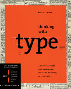
Thinking with Type: A Critical Guide for Designers, Writers, Editors, & Students — by Ellen Lupton
This book doesn’t labor over the minutiae between font faces. Rather, Ellen Lupton asks her readers to consider that from a graphic perspective, type is the principal element of design on the page (or should be). Many of today’s designers got their start after the craft of typesetting was replaced by the automated technology in desktop publishing. As a result, we don’t “hang punctuation,” nor can we tell you why we “kern” or “lead.” Lupton helps us regain some of that control, reminding us how to be inventive with type and when to break the rules. Time spent with this book will encourage you to press a bit harder on your most prolific design element.

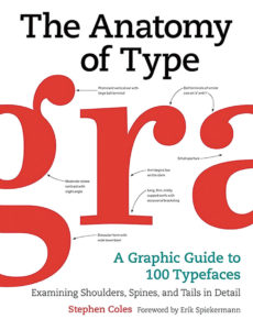
The Anatomy of Type: A Graphic Guide to 100 Typefaces — by Stephen Coles
To learn more about text and display typefaces, view lovely designs, and read well-crafted prose, see this book by Stephen Coles. In it, you will learn that the Ed Interlock typeface has over 1400 ligatures (those combinations of letters that reduce crashes, such as “fi,” and increase readability); that the typeface called Lexicon was created for dictionaries; and that each character of Nitti, a “monospaced typeface,” is the same width (imagine an “i” being the same width as a “w”). For sheer beauty, however, look up Adobe Jenson, especially the “e,” and peruse Bodoni’s ball terminals on the “a” and the “g.” You will never look at letters the same way again.
DON’T JUST MOVE THE DECK CHAIRS ON THE TITANIC
At this point in the process, it is empowering for you, the editor, to have access to and a working knowledge of a layout and design program, such as InDesign, so that you can make these corrections yourself. And, this is when an understanding of typography will prove useful. Each typeface, with all its ears, counters, loops, and ligatures, has its own internal algorithm when words combine on the printed page. How that typeface acts depends on the length of the words and the measure of the column and the sorts of changes that need to be made.
Learning InDesign can be a little or a lot. You do not need to be a Herb Lubalin to correct and fit words on an InDesign page. On the fly, you can view a change in light of the entire sentence and the available real estate. You can decide to recast a sentence to fix a bad break or allow the electronic type tools to solve the problem by tightening or loosening text using tracking. Accessing that simple InDesign setting may be all that is needed to fit that one last change.
Instead of marking up copy; having it corrected; checking the corrections; and invariably musing, “I hope this edit will fix (a) and (b),” make the correction yourself on the designed page. If the correction and words do not reflow as expected, you can fix then and there. Repairing words that break across a turned page and fixing broken names and proper nouns become easily doable. If, as that author wishes, you need to change the title, you can (1) see if the new text will cross into the gutter; (2) move, resize, or track a word, a group of words, or the entire title, for fit; and (3) change the table of contents to mirror the new content. Many benefits accrue to learning how your particular typeface acts when under (correction) pressure and working with it.
(Editors often have pet text preferences. If, like me, you prefer roman parentheses around italic text, you can fix those, as well, without incurring a lot of AA charges for corrections that are rather cosmetic in nature.)
Another important variable in this workflow involves an online component. If printed text will next appear in Hypertext Markup Language, or HTML, editors can use those all-important character styles so that text will translate correctly from print to online. That process, too, can become part of your general workflow. Learning InDesign can save you time and money, produce a more efficient workflow, and allow you to take advantage of existing technology in producing your magazine or journal.
APPRECIATING TYPOGRAPHY IN MULTIPLE PLATFORMS
Unlike a William Caslon or a Claude Garamond, modern type designers have many pressing language needs. For example, Margaret Rhodes writes in Wired that “to be sold globally, modern fonts can require more than 600 characters, to cover every language.” The way in which those characters fit together on a printed page, or on multiple online platforms, continues to push the boundaries of a typeface. The management of spacing between lines of text has evolved from hand-placing lead strips to accessing a drop-down menu. The golden rectangle has also been co-opted for use in typography. (The face of the Parthenon has been said to mirror the dimensions of the golden rectangle.) The typographic golden ratio, that magical proportion of 1:1.618 (where the width of the column is 1.618 times the height), is currently being used to calculate online column widths to increase readability and offer a pleasing reader experience.
Get to know the special tools of your trade, not only the letters, words, and numbers you might work with daily, but also the electronic and typographical engines that drive their placement in print or online. In so doing, quality control (and control, in general) will increase and AAs will decrease. In the process, those ascenders, descenders, counters, loops, ball terminals, serifs, tails, and ears will work to your advantage. That busy, harried reader of your prose will be the benefactor.
Pamela Grainger Tilson is a senior copy editor at the National Council of Teachers of Mathematics. Connect at tinyurl.com/linkedin-tilson.

Get to know the special tools of your trade, not only the letters, words, and numbers you might work with daily, but also the electronic and typographical engines that drive their placement in print or online.